Pages


Thursday, January 30, 2014

Why I Print Before I Share Online

Before I share a photograph online, I print it and I make sure it's everything I want and think it can be.


Once I have a print in hand, opportunity to evaluate the photograph in a new "light" opens which often leads to discovering additional ways to improve or it leads to new creative options for me. I find that a printed image is sometimes a better medium for testing the overall strength of an image, both from a technical standpoint and from an aesthetic perspective as opposed to just working with my images on the screen.


Comparing prints
With a print that I physically hold in my hands, the decisions I made for such things as the brightness, level of detail, the color saturation and the crop of the photograph, may be re-evaluated but now from a new viewpoint. With a print, I will be in different lighting conditions. I will hold it or display at different distances from my eyes. I'll even view it in a different setting such as from a comfortable couch or chair instead of always in front of the computer monitor. When I view my printed image, I free myself from all the distractions I face when I only view the image on the computer.  True, I can view an image full-screen and eliminate visual items on the screen but I am still constrained to the same viewport and setting where my computer is situated. A printed image is something that I may now take with me somewhere else and step away from all of those distractions to allow myself to evaluate the photo with a renewed focus.


What I Do


After I process an image on the computer that I intend to share, I'll then print it, and then ask myself these questions:

  • Is the print the "right" size?
  • Is this the "right" crop?
  • Is this the "right" orientation?
  • Is the print bright enough?
  • Is there enough detail?
  • Are the colors "correct"?
  • Am I engaged and captured by this?

Size


More effective smaller
rather than larger
Some images are "stronger" when they are printed and viewed at larger sizes. For example, wide vistas are usually best larger to give the sensation that the viewer could almost step into the photograph. Other images are more effective when printed smaller. For example I often find that many abstract photos or photos of intimate details are more potent when you condense them into a smaller image that is more easily "digested" by the eyes and the mind. Neither of these are hard and fast rules but by printing your image, but I do find that a photo is more effective at a specific size rather than sharing it at or near full-resolution all the time. I like to say to myself, just because such-and-such site online allows images up to resolution X doesn't mean I have to share all my photos at resolution X.


Crop & Orientation


Cropped to Square (1:1)
In addition to size, both crop and orientation are two more physical attributes of the print that may help in determining a more meaningful image. I'll ask myself with regards to the crop of an image, am I showing enough or too little of the important elements in this photograph? Could the image become more effective if the crop ratio were to change? Sometimes the orientation of an image could be changed to improve it. This is sometimes the case with abstract photos and photos of intimate details where elements such as the sky, the horizon, or people are not present so altering the orientation of the image won't cause additional distractions.


Brightness, Color, and Detail


tilt-shift blur added to draw
more attention to the real
"detail"
I can quickly tell if a print is engaging and captures and holds my attention. If I'm not captivated, qualities such as brightness, detail, and color are sometimes at fault here. These qualities can also be easily adjusted and the image re-printed. By going through this iterative process, the feedback I receive and new creative decisions I make from it, all become part of the discovery of how I may further improve my image.


Many times what looks good on my screen isn't as engaging as a print. Remember, the computer monitor is back-lit and bright and makes everything almost "glow" while a print is lit by reflected light only so it doesn't have the same presence. I do anticipate this and adjust for this with my prints. However, even after compensating, sometimes I find things such as the foreground is still too dark or the colors are too saturated and these actually become a distraction. Later, I find that some of the adjustments I made for a better print are also some of the same adjustments I make to improve the image that I intend to share online.


Image Sets


Contact Sheet
Another tool I use is to print one or more images together and evaluate them side-by-side as a set. I like to make diptychs and triptychs; that is two or three photographs arranged together and designed to be viewed as a whole, not individually. Sometimes I even print contact sheets of nine or twelve images on a page. Now this may seem like a contradiction regarding what I said earlier about eliminating distractions, however, the purpose of this is to see if in this new presentation, do any of the above questions have new answers?


When an image is stacked up against one or more other images, the idea of a collection comes into life and either their similarities or their differences compliment or detract from one another. For example, the crop of an image may work more effectively when it matches the crop of the other images I group it with. Then when viewed alone, the crop helps to make the image even more powerful. Another example I often find is with regards to the colors of an image. Decisions on either color saturation or color cast become more clear once an image is grouped and compared with other images in a set.


Pace


There is one final benefit to this practice. The benefit of time. Printing forces me to slow down my workflow and spend more time with my image. Many times the rush of processing an image that I really love and then share online actually prevents me from realizing its full potential. A slower pace to processing and sharing an image online allows my sub-conscience to fully digest and process all my feelings and memories about the image. That niggling voice in the back of my head telling me there is something not quiet right about an image I've already shared tells me I didn't give myself enough time to fully process it.


Only after I go through this process do I finally reach the point where I am satisfied and then I share the photograph online. By slowing down my pace, I give myself and my work ample time to flourish. Of course once I process and share an image, that doesn't mean I can never go back to it at some time and process it again differently. However, I find that as time moves on and my photography progresses, re-working my older work never becomes a priority as I'm too engaged in and focused on what I am producing now, rather than what I produced in the past. So by spending the time now, I never have to worry about leaving something behind and undiscovered with an image.


Last Thoughts

Printing has become such a valuable part of my workflow that I even if I don't intend to share something online, I still incorporate printing as part of my process. Printing has helped me bridge the gap between what I thought I felt and saw when I made the photograph with the camera to the processed image which is supposed to describe those same feelings and thoughts to a viewer. It has helped me become a better photographer. I think it can help everyone.

Sunday, January 26, 2014

Epson 4900 Maintenance Tank Chip Resetter

My Epson Stylus Pro 4900
I have a love-hate relationship with my Epson Stylus Pro 4900. Yes, it produces amazing prints on un-ending choices of paper, however...she clogs.


One of the downsides of the clogging is how quickly part no. T619000, the waste/maintenance tank, fills up with wasted ink that I use to unclog the printer. Now T619000 isn't that expensive; $16.99 US last time I checked online. However, its a big hunk of plastic that seems like such a waste to have to dispose of. Why couldn't there be a way to re-use it and perhaps "save" the environment just a little by not ending up in the local landfill? Well now there is a way...


Chip Resetter
I found a place online that sells a chip resetter for the T619000. The cost is roughly four times more than the cost of a new tank but long-term this should save me both money and the environment.


Re-using your T619000 with the chip resetter is easy. The instructions with the resetter are very simple and you should follow them precisely.

The instructions state you need another new and empty (i.e. un-used) T619000. This is true so don't forget that part. Also the instructions say to make sure the tank you want to re-use with this process isn't past the point where your printer is giving you the warning to replace it. Once you go past that point, you won't be able to reset the chip using the chip resetter. When you go to reset the chip, if it flashes green, you are good. If it flashes red, either the chip is bad or it's past the point where it can be reset.


So using the chip resetter is easy, here are a few other quick tips about the process...


You'll have to do something Epson explicitly forbids you to do and its depicted clear-as-day on the waste ink tank...

Go ahead, be a rebel

You have to peel away the top seal and open this little guy up. The plastic/mylar-like top is glued on here very well but with a little effort and strength you should be able to peel it away without completely destroying it. Go ahead, open her up. I don't peel it completely off. This is so I can use it to close it back up later.


What you'll find inside is just a bunch of absorbent cotton-like material that should be some-what saturated with ink. Pull all of this out. Don't worry about cleaning the inside unless there is some ink pooling in the bottom. I've never seen this happen though.

This is all that is inside?


Replace the inside with your absorbent material of choice. I simply use a bunch of paper towels folded and bunched up nicely. Just get it all to fit inside snuggly and you'll be fine.

Paper towels


Now, if you didn't peel the original top all the way off, you can re-use that to close and seal the tank back up. I use packaging tape from a tape gun/roller to seal it back up. Don't worry, it doesn't have to be an airtight seal.

Tape it back together


Now you ready to reset the chip using the chip resetter. Remember, if it flashes green when its done, you are good-to-go. If it flashes red, you can't re-use this tank. Maybe its better if you do that first before opening the tank up and replacing the material inside just in case the reset does not work for you.


Remember to put a new, un-used T619000 into the printer first before putting in the tank you just reset. This is part of the process to "trick" the printer into thinking the tank you are re-using is also new and empty.


Once you put the re-used tank into the printer, it should show that its empty and ready for a fresh round of ink to waste!

Ready for more waste ink


I didn't wear gloves through this process so I got a little bit of ink on my hands. Not to worry though, it washes off with soap and water easily!

Ink on hand washes off easily


Wednesday, May 1, 2013

Making "Heart of the Canyon"


Heart of the Canyon
I recently shared this photograph of Antelope Canyon that I took last May while my wife and I were traveling around Utah and Arizona.


I wanted to share how I edited this photograph. So here it goes...


Editing Process


  1. Compare Adobe Camera Raw vs. Use Raw Photo Processor
  2. Process RAW to obtain the overall colors and exposure I'm looking for
  3. Edit in Photoshop

1. ACR vs. RPP


I like to use both Adobe Camera Raw (ACR) and Raw Photo Processor (RPP). If you are not familiar with RPP, you should spend some time after reading this and check it out. Its an excellent tool that I think sometimes gives you better colors than ACR. 


So I will load the RAW file into both ACR and RPP and compare what each of the two tools comes up with after fiddling with each a bit. What I'm looking for is which tool is going to "work for me" creatively. Sometimes the colors are too "off" in ACR. Sometimes the highlights or shadows are not working for me in RPP. Sometimes the underlying curve and exposure automatically applied to the RAW file doesn't work for me in one or the other tool. I try not to spend too much time fiddling here and I make a decision fairly quickly on which one I'll use. Once I chose which tool to use, then I'll close the other and start processing the RAW file for preparation of my final edits in Photoshop.


ACR - defaults
RPP - defaults
To the right is what the image looks like when opening in ACR with my defaults. As you can see, I start with everything zeroed out pretty much. However, all RAW processors apply some type of exposure and curve/tonal adjustments and there's also the question of color profile and how the colors are interpreted. I wasn't too happy with the way things looked in ACR and I know from experience that when this happens, I'm going to have a tough time usually getting ACR to come up with something I like.


So let's take a look at what the image looks like in RPP. To the right is how RPP presents the image, again with my defaults in place, which like ACR, are pretty much zeroed out. My first reaction was that this is probably going to be from where I want to start. The colors are not as wild and the overall tone is more subtle and possibly closer to what it was like when I was photographing this scene. The decision is made and I'm going to work with RPP for this image.


2. Process RAW in RPP


RPP - final

The first things I correct are both the overall exposure and the colors. I work with both at the same time because as you increase or decrease the exposure, the colors will change and either become more or less saturated. I'll try to fix and clipping during this step. In this case I did use the Highlight Recovery feature in RPP and compressed the highlights where the sunlight was peaking through the canyon walls.


I did bump the exposure up about 1 stop in RPP. You should not that even with a 1-stop exposure increase, the RPP image on my screen is still underexposed compared to the ACR default settings. RAW processors are not all equal and here is one place where you can see a difference immediately.


I adjusted the colors in RPP and brought them to a place that I liked. In RPP, you have access to individual multipliers of the Red, Green, and Blue channels. There are presets under the White Balance drop down with values such as 4000k, 5000k, 6250k, etc. I usually choose one of these and then sometimes make small incremental changes to the individual channel multipliers as I see fit. In this case, I first picked a temperature of 5560k and then bumped up the Red channel multiplier by .01 by entering into the field and hitting the UP arrow twice. Pressing the UP arrow once adds .005. This is how RPP allows you to fiddle with many of the values. I find this way more precise than moving sliders.


The only other edits I made in RPP were to add some Local Contrast (10), a little bit of Saturation (10), and made a very small Black Point adjustment (0.20) which is sort of like raising the shadows or shadow recovery in ACR. 


And that's it. Now I have prepared my image for its final editing that will be done in Photoshop.


3. Edit in Photoshop


Photoshop - Final edits
There are a few key goals that I have when working with an image in Photoshop. They are:
  1. Color
  2. Contrast
  3. Creativity

3.1 Color


I try to arrive at the colors I want when processing the RAW file before I get to the Photoshop step. However, some tweaking is usually needed during this step in Photoshop because as I apply other changes to the image, the colors may be affected. When this is the case, I'll generally add or subtract saturation globally using a Vibrance adjustment layer. If there are colors casts or color corrections I think that are needed, I'll use a Hue/Saturation adjustment layer and adjust individual color channels as needed. I'm usually never happy with the way greens come out of the camera so I will make those adjustments during this step in Photoshop and now when processing the RAW file earlier.

In this case, I ended up desaturating the image because the colors were still just a little too "wild" and saturated for me for this image. I did this with a Vibrance adjustment layer. I made Saturation a -9 and Vibrance a +40. When I desaturated the whole image, the less saturated colors were too washed out and thus I attempted to bring them back up by adding a lot of Vibrance

3.2 Contrast


I apply contrast to the image using Luminosity Masks and Curve adjustment layers put together by Tony Kuyper. Tony has a panel extension for Photoshop called TK-ACTIONS Panel. Using Luminosity Masks with Curve adjustment layers lets you target specified tonal ranges of your image and apply contrast to them individually, rather than globally to the whole image. I love using these and Tony's panel extension in Photoshop make these a breeze to use.


For this image, I used two Luminosity Mask - Curve adjustment layers; an Ultra Mid-tones one and an Ultra Darks one. In both adjustment layers I applied a simple S-Curve to add some contrast to just those tonal ranges within the image.

3.3 Creativity


Layers
The last thing is a bucket I call creativity and its anything else I want to do to the image that will complete my creative vision. Those things often include:
  • Dodging and Burning
  • Shadow/Highlights
  • Vignetting
  • Levels and Exposure

I made a small Exposure adjustment after adding the contrast layers. I found things getting a little too "dark" so a +.60 to the Exposure got me back to where I wanted things.


I added a 50% gray layer with a Soft Light Blending Mode and then used the Dodge and Burn tools to draw attention and focus to some of the areas of the photograph where the light was "kissing" the walls of the canyon.


The last thing I did was use the Shadow/Highlights tool to tweak with the highlights and actually reduce them a bit which consequently allowed more color in those highlighted areas to shine through. To do this, I made a composite of all visible layers using the shift-command-option-E keyboard shortcut in Photoshop. I then made my edits in the Shadow/Highlights tool. Finally I moved this layer down lower on the stack before the other layers simply because I liked the look and effect of it there, rather than on top.


Now one thing I neglected to do with the Shadow/Highlights adjustment layer is make it a Smart Object so I can go back and fiddle with the adjustments as needed. I'm so used to working with smart or non-destructive tools adjustment layers that I forgot to use the Smart Object feature.


The End


So that's it! That's my process for editing this image and that's my basic process for editing any image now. I hope maybe you learned something new and I hope to remember to use Smart Objects when needed!
 

Friday, April 12, 2013

How 36 seconds cost me $2931

USB 3.0 and UDMA 60 MB/s vs. UDMA7 160 MB/s 
36 seconds, that's how long it takes to copy 114 images totaling 3.48 GB from my new CF card to my new laptop.


2 minutes and 53 seconds is how long it takes to transfer the same 114 images totaling 3.48 GB from my old CF card to my old laptop.


$2931 is how much the new CF card, reader, and laptop cost me.


That is nearly a 5x speed increase from the old to the new.


With each filled 32GB card, the old setup would take about 26 minutes and 30 seconds while the new setup would only take 5 minutes and 30 seconds.


That's 21 more minutes of extra time! Score technology! Saving us time and making our lives better.


What I am talking about here is the transfer time for images when using USB 2.0 compared to USB 3.0. To get USB 3.0 you have to own a newer laptop or computer. To take advantage of the faster transfer speed you also need a USB 3.0 card reader and a CompactFlash (CF) card capable of faster read speeds, such as the 1000x or UDMA7 compliant cards.


Getting the new laptop, card reader, and CF card is how I arrived at $2931 for 36 seconds and a 5x speed increase.


Is it all worth it?


Yes of course.


Tuesday, January 15, 2013

VELLO Snap-On LCD Screen Protector


This is a quick review of the VELLO Snap-On LCD Protector that I recently purchased for my D800.


The LCD protector that comes with my D800 is functional but has its flaws. It scratches rather easily, which of course is better than scratching the actual LCD that it protects. When it scratches though, if its not a gouge in the plastic, then it develops a haze that makes viewing your LCD more like looking through a plastic milk carton. The LCD protector that comes with my camera covers the LCD but does not prevent dust from getting behind it. Dust eventually gets behind the cover and generally becomes an annoyance after a while and thus forces me to remove it and clean it. Sometimes, grains of sand make their way behind the cover and this is a real problem because sand can definitely scratch my LCD. Something I absolutely don't want!


Looking at my camera and the LCD cover it came with, you can see its time to clean it if not actually replace it. There's a bunch of dust behind it and it looks like maybe a few grains of sand are back there as well. Not good! There are a few scratches and some haze developing, but nothing to get too worked up about.


The packaging for the VELLO Snap-On LCD Screen Protector is attractive. The instructions were simple and clear. Simple remove your old screen protector, clean the LCD if necessary, remove the plastic protector film on the new protector, and then simply snap into place.


It also came with a LCD protector for the top LCD panel. The instructions mentioned an eyepiece protector but this unit didn't come with one.

The back of the main LCD protector has a felt lining around the edges and this I suppose should help keep dust and other unwanted debris from getting behind it. Time will tell.


The small LCD protector had a small amount of adhesive it looked like around the edges to hold it in place. I simply cleaned off the LCD on the camera and then dropped the new protector in place. I applied a small amount of pressure to make sure it was secured and it seems to be firmly in place.


Once installed, the new covers looks great. Compared to the old LCD protector, the new VELLO has a much cleaner look to it. Its black instead of a translucent plastic and blends in well with the camera body to look like you don't even have a protector over the LCD. Images on the back of my camera are clear and vibrant. Its as if there isn't even a cover over the LCD. Time will tell how well this holds up and prevents dust and debris from getting behind the cover. I'll report back after some time on how it holds up.


The small LCD on the top of the camera blends in so well you don't even notice there is a protector over it. Again, the LCD is clear and just as easy to read as if there wasn't a cover over it.


The VELLO sells for $24.95 while the replacement Nikon cover is $16.95. For a few dollars more I believe this is really the better alternative to protecting your screen. Time will tell of course and I'll report back later with what I find after some real use of it.

Friday, June 1, 2012

Experiment with Custom White Balance


I often experiment with custom white balance settings in my camera when photographing landscapes as a way of helping me refine my images. I use it to both explore colors creatively and to help with determining if a scene is worth investing my time to photograph. Many times, subtle and not so subtle changes to the camera's white balance setting yields new ideas and more interest in what i'm photographing. Being fully engaged with what you are photographing is probably the most important thing. If you are not engaged, your viewers won't be engaged, and that will show in your image. Using the custom white balance settings in your camera is a great way to explore and expand your photography.

Since I shoot digitally, changing the white balance of an image before I take it is so simple. I don't have to carry and fumble with multiple color filters as film shooters do. With just a few menu and button presses, I can go from a feeling of calm and cool to warm, hot, and vibrant all in the same scene. I thought of using actual color filters to produce the same results but I found an issue in post production where it can be difficult if not impossible to adjust colors to my liking. Since I shoot RAW images and use Adobe Camera Raw (ACR) to help process my images, I can change the white balance settings of the photograph after the fact just as easily as I can with my camera before I captured the image. In fact, ACR really stretches the limits and allows me to go into territory that my camera simply won't allow me to go to with white balance.

Maybe now you are sold on the idea of how beneficial custom white balance settings can be, now I'll explore just how I use them.

On the left is an image taken in Corson's Inlet near Ocean City, NJ one evening, just after sunset, when high tide was receding in the tidal marsh. There's lots of water and lots of sky so the tones and colors are very similar throughout the entire image. This image is shown with the white balance in my camera set to Daylight, which is about 5200K. ACR displays this as 5000K and -8 Magenta.

By the way, I took this with a Nikon D700 and while i'm not familiar with every other camera brand with regards to custom white balance settings, the numbers won't always match up with mine but through experiment and trial and error, you can achieve the same effects here.

In the image above, what words would you use to describe the colors and tones?
Cool? Subtle? Smooth? Relaxing? Soft? Blue?

Those are the types of colors and moods you get after sunset because all we have now is reflected light and no more direct light from the sun. Soft and blue are how I would describe it. As twilight settles in, everything becomes more soft, subtle, and blue until there is no more light left and all we have is darkness. At the time of searching for this image and taking the photograph, I was not feeling soft and subtle and blue. I was feeling vibrant and thrilled standing in a wonderful water world that seemed out-of-this world! A beautiful burst of color was directly above me in the clouds and the reflected light in the water was begging to be captured. The question was at the time, how could I better capture that thrilling and vibrant feeling in an image?

A custom white balance setting was how!

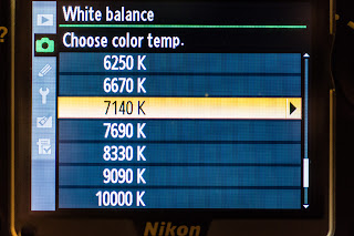
This time I changed the white balance to a custom color temperature of 7140K and then used the fine-tune grid option to introduce more Amber and Magenta. Those settings are A6 and M6. In ACR this image shows as 7450K and +78 Magenta.

The Amber and Blue axis of the fine-tune grid in my Nikon D700 doesn't apply another type of filter. It simply shifts the actual color temperature up or down. This is evident because the custom white balance in the camera was set to 7140K, A6, M6. Fine-tuning the white balance for Amber 6 and Magenta 6 now indicates a color temperature of 9090K. However, in ACR the corrected color temperature is 7450K and +78 Magenta.


What words would you use now to describe the colors and tones in this image?
Dreamy? Vibrant? Unworldly? Exciting? Purply?


This new image is much closer to what I was feeling when I was taking the image and what I wanted to convey. By deliberately introducing a color cast by fine-tuning the white balance in the camera, I am able to change the feeling of the image and more closely deliver what I wanted in the image.

Below is the final image after post-processing. Just a subtle shift in color temperature again and this time to enhance the blues and purples more. In ACR the color temperature is 6200K and +80 Magenta. The shift to a cooler temperature is what is responsible for bringing out the blues and purples more.


Now the one question you may be asking right now that I don't have an exact answer for is, how do I know what color temperature I should use?

You have to experiment. You have to try both when you are taking the photo and then when you are post-processing the photo to see the endless possibilities that are out there. Through trial and error and experimentation are how I usually arrive at a particular setting. Who knows, maybe sometimes when you are in the field taking photographs you later find something more pleasing in post-processing that differs from what you originally envisioned and captured. With the freedom of shooting RAW and software such as Adobe Camera Raw, you are not ever limited or penalized by choices you made when you took the photograph.

There is of course one rule of thumb, so-to-speak, that I can offer that you can use to help with your decision making. Lower temperatures are considered cooler and thus will often yield images with a blue-ish cast. Higher temperatures are considered warmer and will yield images with a golden or yellowish cast. Where things get interesting is when you fine-tune the white balance and you apply a green or magenta cast.

I often apply more magenta when I experiment with white balance. It does a great job of enhancing both red and pink tones and purple tones, depending on what the color temperature is. With cooler temperatures (e.g. 4500K) and a magenta cast, you'll often see deep purple tones. With warmer temperatures (e.g. 6500K) and a magenta cast, you'll often see pinkish tones. I don't often use the green filter in situations such as the one depicted here. However, I can definitely see a benefit with scenes deep within a forest or canopy of lush greens where using the green filter could work.

Results will greatly vary depending on your subject and the lighting of course. These techniques probably won't translate well to portraiture work! Here are a couple of more examples.


These three images were taken a little while after sunrise with some beautiful alto-cumulus clouds in the sky creating a sort of sun pillar effect.

The first image on the left demonstrates what Auto White Balance looks like. ACR reports this as 4000K. Here you can say everything is very blue and cool. The colors in the sky and the clouds were much more brilliant to my eye than this. Its fair to say that this isn't an accurate representation of how that morning looked and felt.

The second image demonstrates a Daylight White Balance setting. ACR reports this as 5500K and +10 Magenta. While there is a bit more color than the first image, it still lacked the punch and vibrancy that I actually saw and felt that morning. Getting there, but not quite all the way there.

The third and final image in this example is the custom White Balance setting I used to take the photograph. This was 5000K, A6, M6 and ACR reports this as 5850K and +76 Magenta. Here now we can see the colors go wild and really draw you into how magnificent that morning really was. Alto-cumulus clouds are some of the finest clouds to lay eyes on and when you couple that with a rising or setting sun, get ready for a wild ride with mother nature nearing her best! Since the colors were so vivid already, I didn't have to raise the color temperature beyond 5000K to really get the pinks and the purples to come alive when applying the Magenta filter.


These two images were taken in the twilight before sunrise. There was a good bit of low clouds on the horizon where the sun would rise and this helped block some of the early light and it seemed to extend twilight just a little bit longer for me.

The first image of two was taken at Daylight White Balance. ACR reports this as 5000K and -6 Magenta (or +6 Green). To me, this again was not an accurate representation of what I was seeing. Deep twilight is very cool and blue and the colors here make me think more of a sea foam green.

The second image is what I took with a custom White Balance. ACR reports this as 4150K and +33 Magenta. By lowering the color temperature and adding a magenta filter I was able to extract a much cooler and softer glow from the scene than previously. Here we see deeper blues and purples with a lower color temperature and some magenta added.

In conclusion...


Don't be afraid and experiment with custom white balance settings both when you are taking photos and afterwards during post-procesing. Don't be afraid to push the limits sometimes and try extreme color temperatures such as 2500K or 10000K or really push the sliders with magenta and green. There are tons of creative possibilities waiting out there and it never hurts to experiment. So give it a try and have fun with it next time you are out capturing the landscapes!
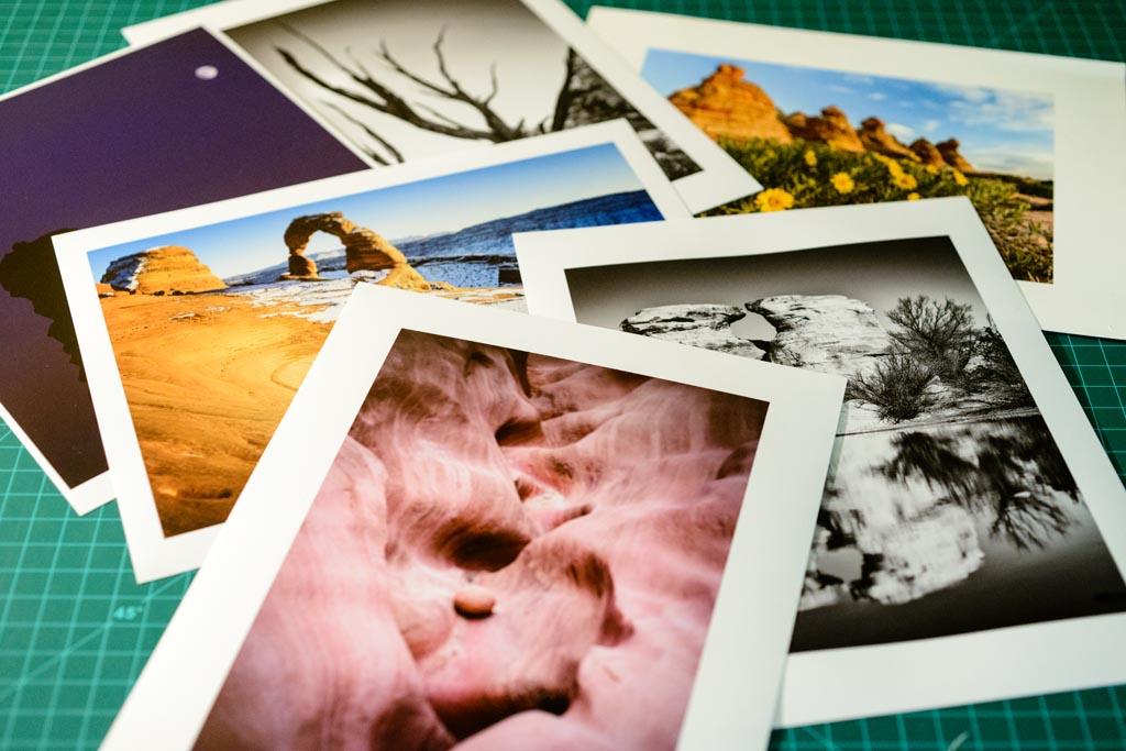


Tuesday, February 7, 2012

Recovery?

I want to talk about something I've learned recently and that's about the blinkeys, blown highlights or clipping, and the magical Recovery slider in Adobe Camera Raw (ACR). You know, the blinkeys. Those insipid pixels that blink on the back of your camera when you review an image and the camera wants to let you know that you've gone too far and clipping is occurring.

Up until now, I've thought of the blinkeys and blown highlights or clipping as being truly evil and something to avoid at all possible cost because its lost data. 255, 255, 255, pure white, no detail. Something your printer won't even print out because there's no white ink!

In order to combat this we are armed with the Recovery slider in ACR. With one quick movement to the right we can eliminate said blinkeys and blast those blown highlights back into the realm of subtle detail! But alas, sometimes the Recovery slider falsely leads us astray and alters our images with a flattened dynamic range and bleeds any pop from them. What's left is a distant memory of the zeal your original image contained.

All is not lost. I've come to realize that not all blinkeys and blown highlights are created equal. Some are not as evil as other would lead you to believe. Sometimes you don't need to touch that Recovery slider at all!

Above is an image where highlight clipping is obviously occurring. Thanks to ACR we can clearly see that and said areas are highlighted in a fantastic and not so subtle red. Usually I would be tempted to slide the Recovery slider to the right until I've eliminated all clipping. In many cases, you'll end up with an image now with a flattened dynamic range and a lot less pop in the highlights and bright areas of the image. Since there's a lot of sky in this photograph, using lots of Recovery has an adverse affect on the image. You can compromise some, leave some clipping but recover some of the blown out areas.

So what's going on here?


I started thinking about what these clipped highlights actually are and what effect do they have on my final product and image. I typically share my images on the Internet like many do and then I print the images that I like best.

So, for sharing on the Internet, do the clipped highlights really matter? I don't think they do.

What about printing? Hmm, well, yea, I think they do matter.

Why? Well first off like I said before, there's no white ink, and second, my printer has a limited color gamut so it's best to try to process my images so they match my printer's color gamut as much as possible so screen and print match as closely as possible.

With this new thinking, clipping matters to me when I'm printing. And what my printer can print is what I should really be concerned with. That lead me to my next question and discovery...

What colors are actually present in these clipped regions?


Lucky for us ACR has the Color Sampler Tool (S). Select this tool and then select a point in your image and ACR will tell you what color is there. So I did that and selected nine different points in the clipped regions.

Those nine different points revealed some very interesting information from them.

It would appear that many of these clipped regions are not actually pure white which I thought was the case. It appears that only some of the RGB values are 255. True, there were some that were pure white, 255, 255, 255. But others were really really light shades of pink and magenta.


So I know my printer can't print out pure white but maybe it can print out really really light shades of pink and magenta. To test that theory out I let go of all desire to slide Recovery to the right and just clicked Open Image with reckless abandon! Well, maybe I'm exaggerating just a bit.

In Photoshop, I turned on Proof Colors and loaded up a profile I would typically use to print out an image like this. I also turned on the Gamut Warning. The result on my screen was what you see below...

That's not so bad, right?


Seems like my printer can't handle a few regions of really really bright magenta and pink. The gray areas are where my printer doesn't have a color to match the color in those areas. Seems like my printer does a pretty good job of rendering the colors that ACR and the blinkeys normally would lead me to believe were evil!

In fact, if you overlay the ACR image and the soft-proofed Photoshop version, you can see how well the colors would hold up in a printed image.

The darkened red areas are the intersection of the areas that are out of gamut for my printer and what ACR says has highlight clipping. There are even regions where there are out of gamut colors but ACR didn't claim any highlight clipping there.

Now I have a lot of confidence in my printer and its ability to print this image and match colors so well that perhaps the subtle tone and color differences in these out of gamut areas won't even be noticeable in a print. I could find out by printing and reviewing. That sounds like a good test. I could also play the compromise game and go back to ACR and move the Recovery slider and then later play with Hue, Saturation, and Vibrance and use brushes or masks of some sort to try and bring these out of gamut colors back in gamut.

Sounds like a lot of work. Why not just print a test image and see what we see? Maybe things aren't as bad and as evil as we have been lead to believe. Perhaps the print will look great regardless of what all this technology says should not! Perhaps using our eyes and a little bit of faith is all we need instead of examining each and every pixel in our images and being fooled by all the alarms and warnings. Beauty is in the eye of the beholder, isn't it?

So, know what is in your image as far as colors. Know your final product and goal. Know what your printer can handle. Print out a test print. Make adjustments as needed and iterate. Don't just blindly move sliders and alter colors simply because the computer told you there may be a problem. In the end, you'll end up with fewer if any compromises and much better images.