Pages


Wednesday, November 23, 2011

Windows Phone 7 app - Shuttermate

I've written my first published Windows Phone 7 app and its called Shuttermate.

I consider it a tool for landscape photographers. It contains a few different simple tools to help you with calculating exposure times or selecting the best filter to use. I do assume two things with this app. One, you use Aperture priority mode with your camera. Two, your camera is a Nikon DSLR. Now your camera doesn't strictly have to be a Nikon DSLR but some of the values you pick from in the tools may not apply to you or maybe your camera has more. I shoot with a Nikon D700 so I targeted everything for that camera.


nd filter

If you want to shoot at a target exposure say because you want to take a photograph of a waterfall and would like the water to be silky smooth with a 2.5 second exposure, you would use the 'nd filter' tool. Just put in your current exposure settings and your target exposure setting of 2.5 seconds and the app will tell you what ND filter density to use.


dynamic range

Taking a photograph that includes both a bright sky and a shadowy and darker foreground? The "dynamic range" tool will tell you the difference in stops between two exposure settings. Just put in your exposure setting for the sky and then another for the foreground and the app will tell you the dynamic range between the two. This may help you select the best ND graduated filter to use perhaps.


big stopper

Do you use a Lee Big Stopper or some other  10-stop ND filter? Use the 'big stopper' tool and put in your initial exposure before you use the filter and the app will tell you what your new exposure time will need to be when you use the filter.


long exposure

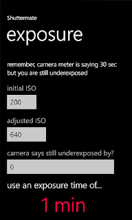
The last tool is one that helps you determine the correct long exposure time if you use the ISO bumping trick as I call it. I learned this trick from a one Bruce Percy while on a workshop with him. If you like to take photographs in low light like I do, say 30 minutes before sunrise or after sunset, most likely your camera won't meter properly and will stop at 30 seconds. At 30 seconds you will probably be underexposed. That's ok, just increase your ISO until the camera meters properly and tells you the scene is properly exposed. Now on my camera, the usable ISO ranges from 200 to 6400, that's 5-stops of dynamic range. If its too dark out, 5-stops may not be enough. Maybe time to break out the flashlights or call it a day? Anyhow, just enter in the initial ISO you started with and then the adjusted ISO and the app will tell you how long of an exposure you will need to take when using the initial ISO. Now on my D700, the display for the metering will also tell me if i'm -3EV or +3EV from a proper exposure. If you've hit the limit for your ISO and are still underexposed but maybe only by -3EV at the most, you can enter this value into the app and it will take it into consideration when telling you the proper exposure time.


That last tool does take a bit of explaining and its only useful in special circumstances. That's why its at the end of the list of tools. I don't use it very often but in the past when I needed this, I would have to perform some mental mathematical gymnastics to figure out my exposure time while the light was changing before my eyes! Working with fractional shutter speeds and exposure times is not exactly "easy" math if you ask me. So this is why I wrote this little app. No more mathematical mental gymnastics while out in the field. Now I can just concentrate on taking photographs and being creative and perhaps let that other half of my brain take a break.

Tuesday, August 30, 2011

JPEG Quality in Photoshop

Regarding the information posted in this article from petapixel.com I decided to do a quick comparison to see if there is some truth to the statements mentioned in there.


I wanted to see what the perceived quality and file size is among various JPEG quality levels when exporting images from Photoshop CS5. I know the article states that sometimes quality is affected opposite from what you might expect but I figured that it was worth a shot. There are no absolutes with many things in life and this shouldn't be any exception.


I took two basic photos. I'm using a Nikon D700, 50mm f/1.8 AI-s lens, and SB-600 flash mounted on camera in TTL. The photos were taken indoors at f/5.6 and 1/60th. The RAW came in at 2832x4256 and 15.04MB. I didn't perform any post-processing and right from Bridge I simply exported 5 JPEGs at quality levels 6, 7, 8, 10, and 12.


Here is a screenshot for Levels 6-8 with one area of detail zoomed in at 200%:


Under close inspection from my end I can actually say that the artifacts that you normally see with JPEG compression is noticeably more going from Level 6 to Level 7 and notice that the file size is nearly the same. The difference is very slight but if you look hard enough (too hard really) you can find them. Level 8 is noticeably larger, as expected, and the amount of artifacts is less.


Here's a screenshot for Levels 10 and 12 with the area of detail zoomed in at 200% again:


Artifacts? There are a few in Level 10 and I would say they are less than the previous batch. What about Level 12? I can actually see a few less again. File size? more than doubled between 10 and 12. As you can see, we are getting quite large as well.


So, what's the quick verdict on this? There seems to be some truth to the statement that when you go from Level 6 to Level 7 you may lose some quality while the file size stays about the same. So Level 6 may be the better alternative to Level 7. However if you are counting pixels perhaps bumping to Level 8 will ease you, that is unless you are trying to stay within a specific threshold for file sizes (please be conscience of mobile users!)


As far as the statements about Levels 11 and 12 being "experimental" and not really adding to overall quality. Well I can't say there is obvious evidence of this because I did notice fewer artifacts when using Level 12 vs. Level 10. The file size did more than double.


Now I know this was not very scientific and there are many types of images and variables that should come into play regarding this, however, doing a thorough scientific evaluation wasn't the point of this little experiment. All I wanted to do is find out if these statements were completely bogus or if they actually had some truth to them. A good place to start with some further research is with the Adobe Photoshop development team. They can answer the differences in the algorithms being used among all the various levels...

Friday, August 5, 2011

Stitching

Two frames, stitched vertically
I've begun experimenting with stitching. That is, taking one xor more photographs (yes, xor, not or. one or the other but not both :) and stitching them together to obtain either a larger field of view and larger image. I like stitching photos because it gives a squarish crop, rather than the standard 3:2 for most cameras today. 3:2 works for many compositions but there are other times that I do prefer something closer to 1:1. I also like stitching because the end result is an image that is far larger and contains far more pixels than my camera can capture alone. This is what I want when I want to print large images and retain as much detail as possible. I'm not interested in switching to medium format film to obtain this same aspect ratio. I like working with digital and all that it provides. I'm also not prepared to dump the cost of a new luxury car entirely on a digital medium format camera as well. There are other options though...


One option is to clunk down about $2000 USD for a Nikon 24mm PC-E lens and use the shift functionality to create multiple images that may be easily stitched. Here you can shift up/down or right/left with the camera in either landscape or portrait orientation to satisfy the need for just about any composition. The other option to consider is a rail or pano(ramic) setup to allow me to create multiple images that may be stitched. This is the less expensive option and I can use it with any lens that I have. I decided to try a simple sliding rail setup and purchased the Really Right Stuff 192-PPP (Precision Plus Package). I didn't get a full panoramic setup for multi-axis rotation of the camera and lens because I didn't really want the added complication (and cost) and I could forgo some of that capability for now. I can always add more hardware later.


Stitching is now very easy when using the PS CS5 Photomerge feature. Results are had in just a few clicks and images are seamlessly blended and distortion free. There's not much to worry about when your images do not suffer from any perspective or distortion problems from the beginning. In particular, you have to avoid parallax distortion or errors between you images. To do this you have to rotate your camera and lens around then entrance pupil or no-parallax point. This is essentially what panoramic setups like the 192-PPP allow you to do.


Not all compositions and images will suffer from this optical phenomenon enough to prevent stitching. Much depends on the subject as well as the the perspective from where the image was taken from frame to frame. In fact, I was successful in stitching together several new images recently without the aid of the 192-PPP. The image to the right is composed of three individual images stitched together. The combination of using a long lens (400mm) and using subjects that were some distance away reduced the amount of vertical movement I made to compose each frame. This reduced the amount of distortion from frame to frame even though I was not rotating or moving the camera and lens around the no-parallax point. I have to owe all of the credit to the awesome power of the Photomerge tool though.


In the end, you'll most likely have to contend with these distortions in your some of your compositions and there is no substitute for knowing how and having the correct tools to do so. You can't always rely on the Photomerge tool to bail you out.


I placed my camera and a 25mm lens with the 192-PPP all on the tripod and then setup a scene to determine the no-parallax point for this lens. I've read that people like to call this the nodal point but from what I understand, this term is technically incorrect for what we are trying to accomplish here. I'll just stick with no-parallax and move on. The scene I setup was just a simple lineup of a near and a far object. Through trial and error I determined the approximate no-parallax point for this lens.


There are a couple of pointers or tips that I found which may be very helpful:

  1. Make sure the camera is level
  2. When rotating the camera to the left or the right, if the far object moves in the same direction in relation to the near object, then you are too far forward, move back
  3. When rotating the camera to the left or the right, if the far object moves in the opposite direction in relation to the near object, then you are too far back, move forward

I then proceeded to go through all of my lenses and do the same. With prime lenses, you just have to do it once. With zoom lenses, you have to do it for each focal length you believe you will use. For example, with my 80-200mm, I determined the no-parallax point for the 80, 105, 135, and 200mm focal lengths. Once that was completed I simply printed these out and made a handy little cheat sheet that I carry with me in my bag that I can refer to each time I need to know the no-parallax point for one of my lenses. Now I can make easily stitch-able images using the no-parallax point without having to calibrate it each time.

Monday, May 23, 2011

Lessons Learned: Valley Forge Sunset Shoot

Image Copyright Joe McNally
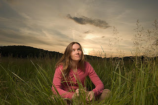
I had an idea. I wanted to experiment and try an outdoor portrait session with some flashes during sunset. The inspiration came from the the truly amazing photographs of Joe McNally. His image to the right is what I always picture in my mind when I think of both Joe and working with flashes. I personally love the outdoors and get fully engrossed when photographing landscapes and Joe McNally's images such as this one resonate with my creative tastes and aspirations for photography.


A few elements that I wanted were an open scene with tall grasses, trees, and the sunset in the background with great skies and colors. I also wanted to shoot wide and use flash to add some dramatic lighting to my subject. I thought of a place and the weather for a  good sunset looked to very likely so we set on out to Valley Forge National Park.


Rebecca and I brought along our cameras, a couple of flash stands, umbrellas, and a 5-in-1 collapsible reflector. We've been to Valley Forge before so I had a good idea where I wanted to be in time for the sunset. We drove around a little, scouting a few other possible locations but ended up just where I first thought we'd be. We arrived just after 6pm so we had plenty of time to setup and prepare. Sunset wasn't until just after 8pm but the surrounding hills, trees, and some cloud cover would lessen the light considerably from about 7:30pm and on wards.


I first setup with the flash high overhead, shooting through an umbrella, pointing straight down. I metered the sky and found that I needed to shoot around f/16 and 1/250 at ISO 200 to get the sky where I wanted to. At this aperture and speed, the little SB-600 was working at full steam and then some probably. I had the SB-600 gelled with a 1/2 CTO so that along with the umbrella was really cutting down on the amount of light getting into the camera. I was shooting using iTTL as well and was set on full-matrix metering. Some test shots showed that while the sky looked pretty good, the light coming down on Rebecca and the surrounding area was just too much, too harsh. I tried to dial in some exposure compensation all the way down to -3 but that still didn't give me the results that I wanted. So I switched off from iTTL and went to manual and then experimented and tried to find the level of light that I wanted.


In hindsight, I should have used a 1-stop or 2-stop ND filter so I could open up my aperture. This may have allowed me to shoot without needing full power from the flash and would've controlled the sky. I should have also switched to spot-metering as well so iTTL didn't think it needed to light-up the whole scene evenly and fire the flash at full power. 


We rolled with some photos and there were still a couple of things that I wasn't satisfied with. First, the composition wasn't good for me. I had to work with the light stand and umbrella to the left and keep it from cropping into the scene. I also had to deal with the sun which was visible but behind the subject. On top of this I had trouble getting the flash to trigger when I moved in too close and lost my line-of-sight to the remote flash. I wanted to get closer, I was shooting with an wide-angle lens, but I couldn't because once I got too close the flash wouldn't trigger. Last, the light still was not just right. I needed some fill on her face to even out the light and shadows.


I mostly solved these problems by using a 36" gold reflector. I placed the reflector on the ground and angled it up at Rebecca. This filled in the shadows on her face and evened things out. I then decided to try putting the reflector directly under the camera and try to use it to bounce the pop-up flash to help trigger the remote. This worked! Though I couldn't get as close as I wanted, I could get closer and I didn't have to try to angle the camera upwards as much towards the remote flash.


Here's where some radio triggers, such as Pocket Wizards, really would have solved the flash triggering issue. I wouldn't have had to compromise my composition as much and worry about line-of-sight. I could have gotten closer and turned off the pop-up flash which would have prevented a few shots with blinking eyes. Having a stand with a boom or having an assistant that could hold the flash and umbrella on a boom would have opened up the left side of my frame and I wouldn't have had to compromise on composition as much by trying to prevent the stand from appearing in the frame.


As the sun started to hide behind clouds and soon the trees and hills in the background, the light changed and faded and I had to change my exposures. It actually became more difficult to achieve the correct balance of light that I was looking for even though the sky wasn't as bright and harsh as it was earlier in the shoot. I tweaked both my exposure and the flash, trying, and hoping to get it right. Once the sky started to go dark and the surrounding landscape fell into dim light as well, we stopped.


I had two very costly mistakes. One, I failed to meter for the sky again. The sky was really getting dark in my exposures and my tweaking wasn't really helping things enough. Plus don't forget that I was still in matrix-metering and that wasn't helping as well. Two, I never looked at my histogram. Not once! I always look at my histogram when shooting! Fail! Why this was any different, I don't know, but this was one of the reasons why my exposures were on the dark side. Third, I had the brightness of my LCD turned up to +3. It was set high because I was shooting in the bright afternoon sunlight earlier. I forgot to change it so what looked decent on my LCD in the evening was actually under-exposed. Double Fail!


I made lots of mistakes but at the same time I learned a great deal from this experience. We also had a lot of fun. Isn't that what photography is all about? Some of these things can easily be corrected by a visit to B&H online while others will take some more patience and practice to master. One thing that I am happy with is realizing that you really can create some dramatic photographs using just a single light. We can't wait to get out there again.

Friday, May 20, 2011

LAB Saturation

I stumbled upon a new (new to me) way for adjusting colors for my photographs in Photoshop using the LAB color mode. I'm not going to go into the technical aspects of the LAB color space because I honestly don't really understand much of it. There's lots of good information out there on the LAB color space on the Web and Dan Margulis has a book Photoshop LAB Color that I've read some if you really want to know more, especially the why part. There is good evidence that the LAB color space is good for certain types of images and certain types of edits. I figured it would be good to simply check this out and see for myself.


What I explored was adjusting color saturation using the LAB color mode. This is an alternative to other Photoshop techniques such as using Hue/Saturation or Vibrance adjustment layers. You may also use this in place of the same sliders found in Camera Raw. Putting aside theory and the why, I decided to let my eyes be the judge.


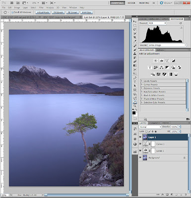
I decided to use one of my favorite images from our last trip to Scotland, Slioch upon Loch Maree. I created a new copy of my original RAW file and in Camera Raw I setup my image in my typical workflow which sets up the image with a good histogram and a rather flat or dull appearance that will later be fine-tuned and brought to life from within Photoshop. The idea I use is to start with a very workable image with the proper exposure and both highlight and shadow detail. Camera Raw helps to set things up, Photoshop is where my creativity is exercised.


Once in Photoshop I start with a Levels adjustment layer to set new black and white points. Next I'll use a Curves adjustment layer to add some initial contrast with a very basic S-Curve.


Now I'll select these new layers including the background and create a new, merged layer, using CTRL+ALT+SHIFT+E (yes, I use Windows). This will create a new layer called Layer 1 that will be a combination of the two adjustment layers and the Background.


Next I'll duplicate this layer and select a New document as the destination. Right-click on the layer in the Layers panel and then select Duplicate Layer... to get the dialog to also select the destination.


Now I have a new document with the new merged layer I just created.


I set the color mode to LAB. From the menu, Image -> Mode -> LAB Color.


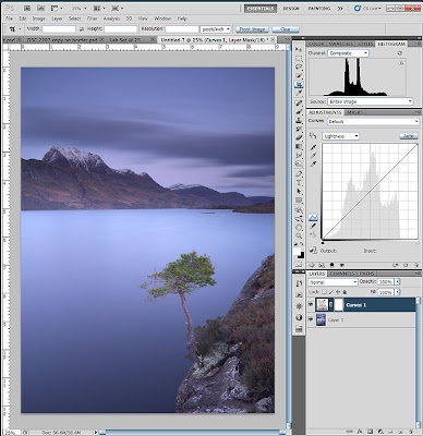
Next I created a Curves adjustment layer. Notice now that there are different values in the channel drop-down of the Adjustments panel. They are Lightness, a, and b.


I adjusted the three channels, adding a standard S-Curve to the Lightness channel for contrast, then I performed adjustments to the a and b channels by pulling in the curves equally on both sides. Photoshop by default places a 4x4 grid in the Curves panel. To get the 10x10 grid just hold down the ALT key and click anywhere in the grid and you'll get a 10x10 grid. Do it again to revert back to a 4x4 grid if you want.


Variances in the amount of contrast and the adjustments in the a and b channels will alter the amount of the effect. Small adjustments actually have a profound effect on the image. The steeper the curve, the more dramatic the effect. If you don't balance the sides out you'll end up with various color casts. You can certainly get very creative and wild here, however, that's note my point in this exercise. I want to simply increase the saturation and vibrancy of the colors here. My adjustments looked as follows:


From here, I selected both my Curves adjustment layer and the Background layer and then created another new merged layer using CTRL+ALT+SHIFT+E. Then I duplicated this layer back to the original document I started with.


I finished up with a few more adjustments and then brought up the previous version of my image and compared them side-by-side in Photoshop.


So, there are not broad or obvious differences between these two images. The color variations are subtle. Is one better than the other? Perhaps at this time I do find the new image using the LAB saturation method more pleasing than the previous edit. Perhaps I'm just being biased to the new technique. Art's a very subjective thing and your likes and dislikes do change over time. LAB color saturation adjustments will be a new tool in my toolbox. It's certainly not the only method available and it shouldn't be. Art is subjective, remember.

Wednesday, May 18, 2011

Shooting How to Make Egg Rolls

Back in March, my mother invited us to help her make some Korean-style egg rolls. It is a Korean tradition for the mother to pass on her kimchi recipe to the future wife of her son so that she can make kimchi just how he likes it. Instead of kimchi we're going with egg rolls. My mother makes the best, as any good Korean mother's son would argue, so passing on this recipe is of great importance. Rather than simply write the recipe down, I decided to photograph the process while taking part in it as well. This turned out not to be as easy as I had originally thought. My mother moved quickly so I had to try to keep pace and I tried to capture the essence (and the recipe) of how to make egg rolls.


When we arrived, my mother had prepped all the ingredients, just like in those cooking shows! We showed up with about 100 dumpling wrappers and 1 lb. of fresh tofu.

What to prep:

  • Finely chopped white onion, about 1 cup from 2 medium-sized onions
  • Diced carrots, about 1/2 cup
  • Many cloves of fresh garlic, minced, alter to taste and likening
  • Chopped green onions, about 1/4 cup, green and white parts are fine


That covers some basic chopping with the knife. Next you'll want to prepare some cellophane noodles. Again this may be found in any Asian market. You'll want about 1-1/2 cups when cooked. So prepare them according to the packaging and then set aside and let cool to room temperature.
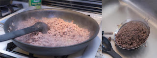


Next, brown the ground beef by sautéing in a pan over medium heat. Don't forget to season a little with some salt and pepper. Drain off the oil and fat and then set aside.


Keep that pan hot because now you'll need to soften the onion and carrots. Add a couple of tablespoons of oil and then cook the onion until translucent and the carrots soft. Season as well. This should take 6-7 minutes. Before you are done, add the minced garlic and let that cook until fragrant which is usually about 30 seconds.


Remove the carrot, onion, garlic mixture from the pan and set aside. Next, grab a packet of your tofu and drain off the liquid in a sieve or strainer. Now it's time to mix everything up and make the filling!
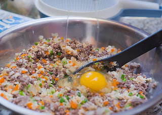

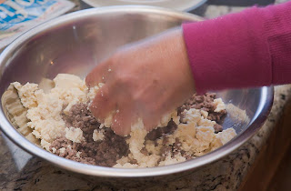
Grab a large mixing bowl to work with and break up the tofu, using your hands, into the bowl until you have small crumbles. Then add the browned meat. Start mixing but be careful not to break everything apart or mush everything up. You want the meat and tofu to retain some of their texture. Add the onion, carrot, garlic mixture as well and combine. Again careful not to mash everything up.


You can add a raw egg now. This will help to act as a binder and give the loosely held ingredients something to stick to. Add two if you think you need it but don't over-do it. You don't want the filling to be too wet.


Roughly chop the cooked cellophane noodles and then add them to the mix. Do you have toasted sesame seeds? No!? You can buy sesame seeds and toast them yourself in a pan over high heat. Lightly toast them, don't burn them. If they get dark brown or black and start releasing their oil you've gone too far. Usually 30-60 seconds is enough. Add a tablespoons to the mix. Some toasted sesame oil for flavor as well. Try a few tablespoons and taste. Yes, taste! I know there's raw egg in there but you have to try and taste things along the way, this is not an exact science!


The filling is done now. You should have a big bowl of stuff. Next comes the part where after a few minutes you wished you never signed-on to this gig and you realize that it would be so much easier to just order up a plate of these from your local Asian restaurant instead. Don't give up! This is the fun part and the part where your dexterity and patience is fully exercised. Plus, you can make it a little competition as well like we did and see who can make the prettiest and the most egg rolls!


First, prep your assembly area. You'll need a bowl of filling and a spoon. You'll need a small bowl with a raw egg wash. Dumpling wrappers and a tray to place your completed egg rolls on.


Assembly is essentially:

  1. Place a wrapper in your hand and then with one of your fingers, coat the outside edge with the egg wash. This is what will bind the egg roll together when you fold it over later.
  2. Place a spoonful of filling into the center of the wrapper. Now how much depends on the size of your wrapper. Too much and you won't be able to close it properly. Too little and you'll end up with left-over filling in the end and no more wrappers.
  3. Fold the wrapper over and make a half circle.
  4. Start at the corner and pinch your way across to the other corner to close the egg roll. Pinch too little and she won't stay shut. Pinch too much and you'll break the wrapper apart.
  5. As long as she stays shut and nothing is leaking out, your done! Now only 99 more to go!
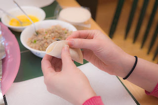


Remember, be gentle, don't over or under-stuff your egg roll, have fun and see how many you can make over your opponents!
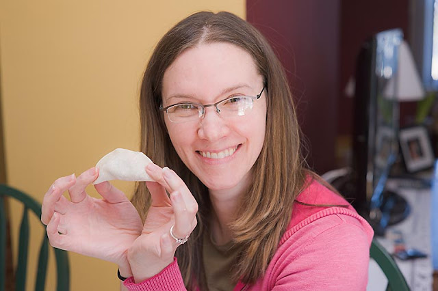


That's one good looking egg roll!


Now before you get to enjoy the fruits of your labor, you'll have to lightly fry these little pockets of joy. This isn't deep-frying but just a light pan-fry with some vegetable oil.


Heat up some oil in a pan. You'll want it no more than a half an inch deep. About a small fingers width (don't put your finger in hot oil!). Don't smoke the oil, that's way too hot. Just hot enough to fry an egg roll in only a couple of minutes.


These are more than lightly fried but its up to you how much you want to cook them. They really only need about a minute or two per side. Just cook each side once then remove from the oil and let them cool down on a plate lined with some paper towels to absorb some of the oil. They will be very hot so be careful when you bite in!


Well, I wish I had more to share but by the time these were ready, the camera was down and forgotten and we were busy stuffing our faces with fresh egg rolls.


A few technical notes on the shots. I used a single flash, a Nikon SB-600 sometimes on the camera and sometimes off. When it's off I can trigger it by simply using the pop-up flash as a commander on my Nikon D700. I used a 1/2 CTO gel on the flash. Sometimes bouncing off the ceiling or wall, sometimes straight on. Everything was taken using a 50mm lens that was manual only. Being manual only was a challenge and many shots were missed because of focus. I did my best on trying to pre-focus for everything and just shoot at consistent distances. Having an auto-focus would have helped tremendously. Lighting conditions were fair enough that AF shouldn't have had problems. The flash and taking photos in close quarters with many close-ups required some additional time spent post-processing to recover highlights and tame some of the blown-out areas.

Would I have done anything differently?
Besides having an auto-focus lens I would have experimented more with depth-of-field some more to alternate between very selective focus shots and shots with everything in focus. I would have also made us of shutter-speed to blur and show some motion when cooking and assembling the egg rolls. Things to keep in mind for the next time...

Happy shooting, cooking, and eating!

Art Wolfe Seminar - Art of Composition

Art Wolfe
Just last weekend, Rebecca and I had the great pleasure of learning about the "Art of Composition" through the words and vision of world renowned nature photographer, Art Wolfe.

If you don't know who Art Wolfe is, please take some time to visit his website (www.artwolfe.com) and see the spectacular images he produces. They are truly inspiring. He also has a TV show called Travels to the Edge which airs on PBS, so check your local listings and watch.

The seminar was an all day session where Art Wolfe took us through his beginnings and his source of inspiration and dissected photography into his basic constituents of composition, light, and having an emotional impact. Art Wolfe's inspiration comes from the great painters through time; Seurat, Picasso, Dali, M.C.Escher, Matisse, Pollock, and many others. There wasn't a single focus on one type of photography, such as nature, wildlife, landscape, portrait, etc. Instead Art Wolfe looks at photography as a whole and explains what he finds as the necessary elements needed to create beautiful images. He emphasized the usage of framing by the great painters and how great photography benefits from the same application with composition. He detailed out his own top ten list of photography "don'ts" and then spoke about some technical aspects such as depth of field, focus, shutter speed, and gear.

We took copious notes and walked away with a great sense of respect and inspiration. One day we hope to meet Art Wolfe again, perhaps on a workshop, and learn even more from him. Until then, here are just a couple of quotes that we took away from the seminar:

Surround yourself with your art. Print and hang your images in your home. Make your home a place that comforts you and encourages and inspires your art.

If you only spend a second looking at an image, then I've failed you as a photographer in creating a great photograph because I didn't make a connection with you.

When you let go of the literal and find the abstract the magic will happen.


Wednesday, April 27, 2011

Sharpening for the Web

Here is something that I've known about for some time, put it on my list of things to learn and do, but haven't taken the time to just do it until now...sharpen my images for the Web.

Some of us, me included, don't post SOTC (straight out of the camera), full-size images on the Web. That means you have to resize them using Photoshop, Lightroom, or whatever your image editing software of choice is. Resizing an image also means resampling the image from one dimension to another, say 2832x4256 (12MP) to 683x1024. When you resample an image this way, that is downsampling, you are reinterpreting the pixels and you are losing data! There's all sorts of names for the phenomenon that goes on when you do this, ringing, aliasing, blurring, artifacts, etc. There are also all sorts of algorithms that can be used to resample your images and each has a pretty significant impact on the quality of your image.

I won't go into a a long technical discussion about resampling algorithms and sharpening algorithms. You can read up all about them on the Web if you are interested. Instead i'll just show you a workflow that I'm using now that creates great looking images from your full-sized images for the Web. Perfect for Facebook, Flickr, Tumblr, and the like.


    1. After you prepare you image and have completed all your post processing, export or create a full-sized JPEG of your photograph. Then open the JPEG in Photoshop. Here is the original, full-sized JPEG of the image I'll be working with here (Click on the image to see it full-size).


    2. Resize your image to your new dimensions. Here I am sizing this to 683x1024 for the Web. Select Bicubic Sharper (Best for reduction) for the resampling algorithm.


    3. Now that your image has been resized and resampled, it's time to apply some more sharpening to try to reel in some of the detail that has been lost. For this I use the Unsharpen Mask... Filter. I typically try amounts from 200% to 400% and a radius of 0.3 pixels and leave threshold at 0.


    4. Now your image is ready for the Web!


    Here's a comparison between the unsharpened image and the sharpened version after resizing the images. Roll-over the image with your mouse to see the sharpened version.

    These images are zoomed at 300%. Notice the difference in texture of the football and the sharpening and detail in the face. While there are some visible artifacts in the sharpened version, remember we are viewing this image enlarged at 300%. At 100% you won't be able to see these (see the next image below).


    roll-over with your mouse to see the sharpened version


    Here are the two final images, again for comparison, now at just 100%. Roll-over with your mouse to see the sharpened version.

    Can you spot the artifacts now? I don't think so.

    Which one looks better? The sharpened version if you ask me.

    This is my nephew btw. I can see much better detail in the football, his face, his hair, his tattoes, his shirt, and his pants. The overall effect isn't obviously noticeable but it results in a better looking image. Isn't that the point? So now you can create great images for the Web and have everyone envious asking "how do you take such great photos?"


    roll-over with your mouse to see the sharpened version

    Saturday, April 16, 2011

    TIP: Using your pop-up flash as a commander

    I recently got to see Joe McNally and David the Strobist Hobby in action when the Flash Bus Tour stopped in Philadelphia. Man, they make things look so easy. It was an amazing time to see these two pros and living legends in action.

    Joe McNally is a big proponent of Nikon CLS/i-TTL, so he's been using an SB-800/900 Speedlight or even the pop-up flash as a commander. No news here right? We all know as well that you can set your Speedlight so that it does NOT contribute to the exposure of your scene. But it will still produce some visible light via the pre-flash that can land you in a snafu because you've got a "blinker" on your hands. What's the alternative? Radio triggers? SU-800 since it's IR and not visible light? Remote cord so your commander is off-axis and not going to be in your subjects direct line of vision? All good options. But what about if you are using your pop-up flash as a commander and that's all you've got?

    Electrical tape.

    Just grab a small bit of electrical tape and cover up your pop-up flash, not entirely, but enough that it hides the direct visible light that would usually fire directly into your subjects eyes and thus cause them to blink. For me on my D700, the tape acts like a curtain and light spills out the sides and bottom from behind the tape and this is what allows you to still trigger your Speedlights. I've successfully tested this, indoors, in a variety of situations. Just as long as you get the sensor on the Speedlight to point towards you, it works.

    I'm sure there are situations that this would inhibit things and outdoors could be out of the question for this but its a cheap alternative to the other more costly alternatives.

    Tuesday, March 29, 2011

    eBook - Guy Tal's Creative Landscape Photograph

    I am currently reading Guy Tal's Creative Landscape Photography eBook. Guy Tal is a very talented landscape photographer and writer based in Colorado but ventures outward and explores the vast and scenic West. Check out his images. I'm sure you'll agree he has a very bold and sharp style in his wonderful collection of photographs.

    About his new eBook then...

    Guy's thoughts and techniques on landscape photography come across as being very intelligent, thoughtful, and driven. He presents some real structure and actual exercises to use that will "exercise your creative muscle", as he says. They are in fact very concrete and sound ideas that you can use immediately. The eBook is well designed with text and example images flowing nicely from page to page. It is in Adobe PDF format and 86 pages. I'm mainly reading it on my Nook Color so anyone with a similar tablet should have no problems.

    I'm about half way through and overall its been a very good read and great value at only $9.95. I'm sure i'll have more to say once I've digested all the content but until then, if you are looking for ways to improve your creativity and landscape photography, pick up Guy's eBook.

    Don't take my word for it, landscape and nature photographer's Darwin Wigget and Sam just published a review of their own on Guy's new eBook.

    Monday, March 28, 2011

    White Vignettes

    I like vignettes. I almost always apply a little or a lot to my images. In CS5 and ACR, I use the Lens Correction feature but I almost always turn the vignette correction slider all the way to the left to turn it off. I generally use vignettes to darken down the edges of my images to draw attention and focus to the center. On one occasion, I used a white vignette instead with this photograph of a tree during a winter storm. There was snow on the ground and the snow was falling fast and the usage of a white vignette, instead of a black vignette, really helped to simplify the composition and reinforce the mood; a dreamy winterly scene.

    So if you like vignettes as well, don't forget they can go the other way too!

    tree in winter storm

    Wednesday, March 23, 2011

    Borders, Revisited

    I decided to again revisit borders with my images. When I just last spoke about borders and their impact on the success of a photograph, I was just beginning to experiment with them. I have quickly realized their benefits, even with images posted on the web, however, I wasn't completely satisfied with my initial tries at it.

    I wanted this time to use borders and mimic their appearance of when a print is matted and framed. We all view so many photographs on the Internet now. When was the last time we walked into a gallery or spent the time, money, and effort to carefully print,matte, and frame an image? The end result is so much more inspiring and vivid compared to what I now think of as an unfinished product, that is what comes out of our camera and maybe goes through a few edits.

    So here is the finished product, so to speak:


    The double borders and white matte really isolate this image from its surroundings. Even when viewed on the web, don't you agree? I added a caption as well. For me, I like to have a bit of more information about any image that I see. Perhaps a name or a location. Something that helps me to associate the photograph or helps to tell the story of the image. I was undecided on whether to add my name or my blog URL as well. Both seemed too much. So I settled on just my name. Feels odd to see my name like this but at the same time I feel proud to share images.

    Again I used Photoshop and the same techniques as from before by simply adjusting the canvas size. This time to get the multiple borders I did it in stages. First the inner black border by increasing the width and height of the canvas size by 20 pixels and setting the canvas extension color to black. Then I added one inch to the width and one inch to the height of the canvas and this time setting the canvas extension color to white. Finally I added one more inch to the canvas height and used black for the canvas extension color but this time I set the anchor to top center so that only the bottom end of the canvas received the one inch extension.

    Setting the Anchor point


    When I took the original photograph, I was enamored with the location and subject. The circular pool of water set the stage for the small and whispy-like waterfall that cascaded over brightly-toned weathered rocks that were cut into various slabs and layers. A beautiful pine angled overhead and would stand out against the clear blue skies of the afternoon. I had high hopes for the photographs that I took here. I used several 3-stop ND filters to be able to drag the shutter long enough to blur the water. I also used a 1-stop hard ND grad to tone down the bright sky. Even with this setup, the rock wall was still mostly in shadow so some fill light adjustment was necessary in ACR to bring them out.

    I'm not fully satisfied with the final composition and overall tones in the photo though. I used my new Sigma DG 105mm polarizer on my Lee filter kit. The obvious dark band in the sky is seen because of the polarizer and shooting in a direction that would combine polarized and non-polarized sky. The sun was to the left of me at roughly 10 o'clock. I'm not sure if I needed the polarizer at this point. We were in bright afternoon light and I was hoping it would tone down on the reflections off the rocks and the water. Because of all this, I decided to convert the image to black and white.

    There is also a lot of dead-space in the upper left part of the frame. If I had moved right, the pine tree would be covered by the rock ledge. If I had moved left there would be more tree and bracken to contend with above the falls that would have just blended the two together. So I compromised and settled on a composition.

    Here is the unfinished photograph before the final editing:

    25mm f/16 4sec

    In the end, by being creative with the framing and converting the image to b&w, I ended up with an image that I now enjoy.

    Tuesday, March 15, 2011

    TiltShift Generator

    I've always been intrigued on the novelty of using a tilt-shift lens to create a miniature-look for a photograph. That would not be the sole reason for me to try to justify purchasing an expensive tilt-shift lens such as the Nikon PC-E 24mm. I'd like to add this lens to my collection because of its ability to control depth-of-field for landscape images without being constrained to using small apertures. I'd also like to explore a technique from Darwin Wiggett where he uses shift to then stack two images together to create larger images for expansive panoramics by stacking two images horizontally or by creating a square-like crop with two images stacked vertically. Check out this his blog and this page for more information about this technique.

    In the mean time, I found this nifty little application from Art & Mobile that allows you to take any image and put the miniature-look on it. Find it here.

    I used the Adobe AIR version of their application. Here are the before and after images:

    before

    after
    I'm seriously lacking any more images right now to play around with this fun little tool I'll have to get out and keep this in mind when shooting or when I have my camera handy. That is, until I get the real tilt-shift lens and then I get serious, lol.

    Saturday, March 12, 2011

    Borders

    I've never spent any time, up until now, thinking about borders. Even when I've had a few of my photographs printed and framed, again, I haven't thought much about borders. I've considered the frame or the matte, which is a kind of border. However, I never considered actually applying a border to the image itself.

    On the web, and even when printing your final image, a border can be very important. It can help with conveying the message of your photograph. With a border, you may be saying, here is where the image begins and ends. Other borders may help accentuate a specific feeling or mood.

    So I've worked on a new image of mine and this time I created a border that I felt helped to reinforce the dream-like mood.


    I created this border in Photoshop by selecting the perimeter of the image and then while in quick mask mode I used a splatter brush to draw the edges of the border. Next I added some Gaussian Blur to soften the brush strokes and edges. Then, I simply filled this area with white. I refined the overall thickness of the border by re-adjusting the canvas size of the image. This framed the image in a broken and hazy-like border that to me matched the dream-like feeling of the photograph.

    Here's the same image without any border.


    Which do you prefer?

    Tuesday, March 8, 2011

    Tone Curves

    I've always been either afraid and reluctant to understand tone curves in Photoshop for years. I knew that great power came from it but I assumed that great knowledge was needed in order to make use of it properly. Over the past year after going on a couple of photography workshops, I began to learn some real uses of curves. I began using curves and layers in Photoshop during my post-processing workflow to apply things like gradient filters, vignettes, and other localized exposure adjustments (i.e. dodging and burning). I also experimented with applying basic s-curves for contrast and sometimes used the default options for medium and light contrast. I would also use these in conjunction with the other plethora of sliders in Adobe Camera Raw. I never really understood the relationship between the other adjustment sliders and the tone curve. That is until now.

    I came across the website and blog of Michael Frye (www.michaelfrye.com), an outstanding landscape photographer. I purchased his Land and Light eBook. In it he unraveled the mystery of tone curves and making adjustments in Lightroom (or Adobe Camera Raw and Photoshop)! I now have a greater understanding of (1) how to use the tone curve and (2) how it can do just about everything that all those other little sliders in ACR or Lightroom do instead.

    Michael Frye's basic workflow for landscape digital photography is explained in his eBook so I gave it a go last night. I found it actually very easy and very powerful to use. It also felt more "correct" to make adjustments using the tone curve rather than making small adjustments with a dozen other sliders. In one simple tool, I can make my overall tonal adjustments for an image.

    Now I start ACR with the sliders all set to 0, set my white balance, camera profile (ACR 4.6), crop and do any spot removal. Things look rather dull and gray, but this is really like seeing things straight out of camera. I'll get a chance to make the tonal adjustments afterwards...

    Next comes working with a point curve for my tonal adjustments. By setting the black and white points and then adjusting the curve to add contrast and brighten the image, I feel that I get a finer level of control with far fewer "moving of various sliders" than I would have in the past. Now this image has some pop and contrast and the colors are already deeply saturated. Look at the histogram now...


    I'll add a few tweaks in Photoshop next. First some more vignette because I love vignette. I'll do some simple dodging for the mountain and the tree to highlight them more. Then I'll add a simple border to frame things. This is the final result...


    Compare it to how I first edited this image a couple of weeks ago. This first edit is rather flat and the tones are pushed more so the colors are little uneasy. Not what it actually looked like when I took the photograph...


    While I do like my first edit of this image, after trying out this new technique, I think I'll have more creative control over my images and that will lead to some better final works. For me, I feel that I've done more with less, so to speak. The two images aren't drastically different but when your workflow becomes more intuitive, the final results are more satisfying. Whenever I end up doing less to an image, I'm more pleased with it. What do you think?