Pages


Showing posts with label workflow. Show all posts

Thursday, January 30, 2014

Why I Print Before I Share Online

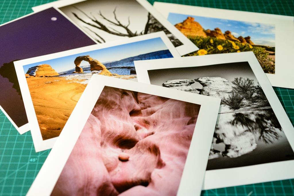
Before I share a photograph online, I print it and I make sure it's everything I want and think it can be.


Once I have a print in hand, opportunity to evaluate the photograph in a new "light" opens which often leads to discovering additional ways to improve or it leads to new creative options for me. I find that a printed image is sometimes a better medium for testing the overall strength of an image, both from a technical standpoint and from an aesthetic perspective as opposed to just working with my images on the screen.


Comparing prints
With a print that I physically hold in my hands, the decisions I made for such things as the brightness, level of detail, the color saturation and the crop of the photograph, may be re-evaluated but now from a new viewpoint. With a print, I will be in different lighting conditions. I will hold it or display at different distances from my eyes. I'll even view it in a different setting such as from a comfortable couch or chair instead of always in front of the computer monitor. When I view my printed image, I free myself from all the distractions I face when I only view the image on the computer.  True, I can view an image full-screen and eliminate visual items on the screen but I am still constrained to the same viewport and setting where my computer is situated. A printed image is something that I may now take with me somewhere else and step away from all of those distractions to allow myself to evaluate the photo with a renewed focus.


What I Do


After I process an image on the computer that I intend to share, I'll then print it, and then ask myself these questions:

  • Is the print the "right" size?
  • Is this the "right" crop?
  • Is this the "right" orientation?
  • Is the print bright enough?
  • Is there enough detail?
  • Are the colors "correct"?
  • Am I engaged and captured by this?

Size


More effective smaller
rather than larger
Some images are "stronger" when they are printed and viewed at larger sizes. For example, wide vistas are usually best larger to give the sensation that the viewer could almost step into the photograph. Other images are more effective when printed smaller. For example I often find that many abstract photos or photos of intimate details are more potent when you condense them into a smaller image that is more easily "digested" by the eyes and the mind. Neither of these are hard and fast rules but by printing your image, but I do find that a photo is more effective at a specific size rather than sharing it at or near full-resolution all the time. I like to say to myself, just because such-and-such site online allows images up to resolution X doesn't mean I have to share all my photos at resolution X.


Crop & Orientation


Cropped to Square (1:1)
In addition to size, both crop and orientation are two more physical attributes of the print that may help in determining a more meaningful image. I'll ask myself with regards to the crop of an image, am I showing enough or too little of the important elements in this photograph? Could the image become more effective if the crop ratio were to change? Sometimes the orientation of an image could be changed to improve it. This is sometimes the case with abstract photos and photos of intimate details where elements such as the sky, the horizon, or people are not present so altering the orientation of the image won't cause additional distractions.


Brightness, Color, and Detail


tilt-shift blur added to draw
more attention to the real
"detail"
I can quickly tell if a print is engaging and captures and holds my attention. If I'm not captivated, qualities such as brightness, detail, and color are sometimes at fault here. These qualities can also be easily adjusted and the image re-printed. By going through this iterative process, the feedback I receive and new creative decisions I make from it, all become part of the discovery of how I may further improve my image.


Many times what looks good on my screen isn't as engaging as a print. Remember, the computer monitor is back-lit and bright and makes everything almost "glow" while a print is lit by reflected light only so it doesn't have the same presence. I do anticipate this and adjust for this with my prints. However, even after compensating, sometimes I find things such as the foreground is still too dark or the colors are too saturated and these actually become a distraction. Later, I find that some of the adjustments I made for a better print are also some of the same adjustments I make to improve the image that I intend to share online.


Image Sets


Contact Sheet
Another tool I use is to print one or more images together and evaluate them side-by-side as a set. I like to make diptychs and triptychs; that is two or three photographs arranged together and designed to be viewed as a whole, not individually. Sometimes I even print contact sheets of nine or twelve images on a page. Now this may seem like a contradiction regarding what I said earlier about eliminating distractions, however, the purpose of this is to see if in this new presentation, do any of the above questions have new answers?


When an image is stacked up against one or more other images, the idea of a collection comes into life and either their similarities or their differences compliment or detract from one another. For example, the crop of an image may work more effectively when it matches the crop of the other images I group it with. Then when viewed alone, the crop helps to make the image even more powerful. Another example I often find is with regards to the colors of an image. Decisions on either color saturation or color cast become more clear once an image is grouped and compared with other images in a set.


Pace


There is one final benefit to this practice. The benefit of time. Printing forces me to slow down my workflow and spend more time with my image. Many times the rush of processing an image that I really love and then share online actually prevents me from realizing its full potential. A slower pace to processing and sharing an image online allows my sub-conscience to fully digest and process all my feelings and memories about the image. That niggling voice in the back of my head telling me there is something not quiet right about an image I've already shared tells me I didn't give myself enough time to fully process it.


Only after I go through this process do I finally reach the point where I am satisfied and then I share the photograph online. By slowing down my pace, I give myself and my work ample time to flourish. Of course once I process and share an image, that doesn't mean I can never go back to it at some time and process it again differently. However, I find that as time moves on and my photography progresses, re-working my older work never becomes a priority as I'm too engaged in and focused on what I am producing now, rather than what I produced in the past. So by spending the time now, I never have to worry about leaving something behind and undiscovered with an image.


Last Thoughts

Printing has become such a valuable part of my workflow that I even if I don't intend to share something online, I still incorporate printing as part of my process. Printing has helped me bridge the gap between what I thought I felt and saw when I made the photograph with the camera to the processed image which is supposed to describe those same feelings and thoughts to a viewer. It has helped me become a better photographer. I think it can help everyone.

Wednesday, May 1, 2013

Making "Heart of the Canyon"


Heart of the Canyon
I recently shared this photograph of Antelope Canyon that I took last May while my wife and I were traveling around Utah and Arizona.


I wanted to share how I edited this photograph. So here it goes...


Editing Process


  1. Compare Adobe Camera Raw vs. Use Raw Photo Processor
  2. Process RAW to obtain the overall colors and exposure I'm looking for
  3. Edit in Photoshop

1. ACR vs. RPP


I like to use both Adobe Camera Raw (ACR) and Raw Photo Processor (RPP). If you are not familiar with RPP, you should spend some time after reading this and check it out. Its an excellent tool that I think sometimes gives you better colors than ACR. 


So I will load the RAW file into both ACR and RPP and compare what each of the two tools comes up with after fiddling with each a bit. What I'm looking for is which tool is going to "work for me" creatively. Sometimes the colors are too "off" in ACR. Sometimes the highlights or shadows are not working for me in RPP. Sometimes the underlying curve and exposure automatically applied to the RAW file doesn't work for me in one or the other tool. I try not to spend too much time fiddling here and I make a decision fairly quickly on which one I'll use. Once I chose which tool to use, then I'll close the other and start processing the RAW file for preparation of my final edits in Photoshop.


ACR - defaults
RPP - defaults
To the right is what the image looks like when opening in ACR with my defaults. As you can see, I start with everything zeroed out pretty much. However, all RAW processors apply some type of exposure and curve/tonal adjustments and there's also the question of color profile and how the colors are interpreted. I wasn't too happy with the way things looked in ACR and I know from experience that when this happens, I'm going to have a tough time usually getting ACR to come up with something I like.


So let's take a look at what the image looks like in RPP. To the right is how RPP presents the image, again with my defaults in place, which like ACR, are pretty much zeroed out. My first reaction was that this is probably going to be from where I want to start. The colors are not as wild and the overall tone is more subtle and possibly closer to what it was like when I was photographing this scene. The decision is made and I'm going to work with RPP for this image.


2. Process RAW in RPP


RPP - final

The first things I correct are both the overall exposure and the colors. I work with both at the same time because as you increase or decrease the exposure, the colors will change and either become more or less saturated. I'll try to fix and clipping during this step. In this case I did use the Highlight Recovery feature in RPP and compressed the highlights where the sunlight was peaking through the canyon walls.


I did bump the exposure up about 1 stop in RPP. You should not that even with a 1-stop exposure increase, the RPP image on my screen is still underexposed compared to the ACR default settings. RAW processors are not all equal and here is one place where you can see a difference immediately.


I adjusted the colors in RPP and brought them to a place that I liked. In RPP, you have access to individual multipliers of the Red, Green, and Blue channels. There are presets under the White Balance drop down with values such as 4000k, 5000k, 6250k, etc. I usually choose one of these and then sometimes make small incremental changes to the individual channel multipliers as I see fit. In this case, I first picked a temperature of 5560k and then bumped up the Red channel multiplier by .01 by entering into the field and hitting the UP arrow twice. Pressing the UP arrow once adds .005. This is how RPP allows you to fiddle with many of the values. I find this way more precise than moving sliders.


The only other edits I made in RPP were to add some Local Contrast (10), a little bit of Saturation (10), and made a very small Black Point adjustment (0.20) which is sort of like raising the shadows or shadow recovery in ACR. 


And that's it. Now I have prepared my image for its final editing that will be done in Photoshop.


3. Edit in Photoshop


Photoshop - Final edits
There are a few key goals that I have when working with an image in Photoshop. They are:
  1. Color
  2. Contrast
  3. Creativity

3.1 Color


I try to arrive at the colors I want when processing the RAW file before I get to the Photoshop step. However, some tweaking is usually needed during this step in Photoshop because as I apply other changes to the image, the colors may be affected. When this is the case, I'll generally add or subtract saturation globally using a Vibrance adjustment layer. If there are colors casts or color corrections I think that are needed, I'll use a Hue/Saturation adjustment layer and adjust individual color channels as needed. I'm usually never happy with the way greens come out of the camera so I will make those adjustments during this step in Photoshop and now when processing the RAW file earlier.

In this case, I ended up desaturating the image because the colors were still just a little too "wild" and saturated for me for this image. I did this with a Vibrance adjustment layer. I made Saturation a -9 and Vibrance a +40. When I desaturated the whole image, the less saturated colors were too washed out and thus I attempted to bring them back up by adding a lot of Vibrance. 

3.2 Contrast


I apply contrast to the image using Luminosity Masks and Curve adjustment layers put together by Tony Kuyper. Tony has a panel extension for Photoshop called TK-ACTIONS Panel. Using Luminosity Masks with Curve adjustment layers lets you target specified tonal ranges of your image and apply contrast to them individually, rather than globally to the whole image. I love using these and Tony's panel extension in Photoshop make these a breeze to use.


For this image, I used two Luminosity Mask - Curve adjustment layers; an Ultra Mid-tones one and an Ultra Darks one. In both adjustment layers I applied a simple S-Curve to add some contrast to just those tonal ranges within the image.

3.3 Creativity


Layers
The last thing is a bucket I call creativity and its anything else I want to do to the image that will complete my creative vision. Those things often include:
  • Dodging and Burning
  • Shadow/Highlights
  • Vignetting
  • Levels and Exposure

I made a small Exposure adjustment after adding the contrast layers. I found things getting a little too "dark" so a +.60 to the Exposure got me back to where I wanted things.


I added a 50% gray layer with a Soft Light Blending Mode and then used the Dodge and Burn tools to draw attention and focus to some of the areas of the photograph where the light was "kissing" the walls of the canyon.


The last thing I did was use the Shadow/Highlights tool to tweak with the highlights and actually reduce them a bit which consequently allowed more color in those highlighted areas to shine through. To do this, I made a composite of all visible layers using the shift-command-option-E keyboard shortcut in Photoshop. I then made my edits in the Shadow/Highlights tool. Finally I moved this layer down lower on the stack before the other layers simply because I liked the look and effect of it there, rather than on top.


Now one thing I neglected to do with the Shadow/Highlights adjustment layer is make it a Smart Object so I can go back and fiddle with the adjustments as needed. I'm so used to working with smart or non-destructive tools adjustment layers that I forgot to use the Smart Object feature.


The End


So that's it! That's my process for editing this image and that's my basic process for editing any image now. I hope maybe you learned something new and I hope to remember to use Smart Objects when needed!
 

Wednesday, April 27, 2011

Sharpening for the Web

Here is something that I've known about for some time, put it on my list of things to learn and do, but haven't taken the time to just do it until now...sharpen my images for the Web.

Some of us, me included, don't post SOTC (straight out of the camera), full-size images on the Web. That means you have to resize them using Photoshop, Lightroom, or whatever your image editing software of choice is. Resizing an image also means resampling the image from one dimension to another, say 2832x4256 (12MP) to 683x1024. When you resample an image this way, that is downsampling, you are reinterpreting the pixels and you are losing data! There's all sorts of names for the phenomenon that goes on when you do this, ringing, aliasing, blurring, artifacts, etc. There are also all sorts of algorithms that can be used to resample your images and each has a pretty significant impact on the quality of your image.

I won't go into a a long technical discussion about resampling algorithms and sharpening algorithms. You can read up all about them on the Web if you are interested. Instead i'll just show you a workflow that I'm using now that creates great looking images from your full-sized images for the Web. Perfect for Facebook, Flickr, Tumblr, and the like.


    1. After you prepare you image and have completed all your post processing, export or create a full-sized JPEG of your photograph. Then open the JPEG in Photoshop. Here is the original, full-sized JPEG of the image I'll be working with here (Click on the image to see it full-size).


    2. Resize your image to your new dimensions. Here I am sizing this to 683x1024 for the Web. Select Bicubic Sharper (Best for reduction) for the resampling algorithm.


    3. Now that your image has been resized and resampled, it's time to apply some more sharpening to try to reel in some of the detail that has been lost. For this I use the Unsharpen Mask... Filter. I typically try amounts from 200% to 400% and a radius of 0.3 pixels and leave threshold at 0.


    4. Now your image is ready for the Web!


    Here's a comparison between the unsharpened image and the sharpened version after resizing the images. Roll-over the image with your mouse to see the sharpened version.

    These images are zoomed at 300%. Notice the difference in texture of the football and the sharpening and detail in the face. While there are some visible artifacts in the sharpened version, remember we are viewing this image enlarged at 300%. At 100% you won't be able to see these (see the next image below).


    roll-over with your mouse to see the sharpened version


    Here are the two final images, again for comparison, now at just 100%. Roll-over with your mouse to see the sharpened version.

    Can you spot the artifacts now? I don't think so.

    Which one looks better? The sharpened version if you ask me.

    This is my nephew btw. I can see much better detail in the football, his face, his hair, his tattoes, his shirt, and his pants. The overall effect isn't obviously noticeable but it results in a better looking image. Isn't that the point? So now you can create great images for the Web and have everyone envious asking "how do you take such great photos?"


    roll-over with your mouse to see the sharpened version