Pages


Tuesday, January 15, 2013

VELLO Snap-On LCD Screen Protector


This is a quick review of the VELLO Snap-On LCD Protector that I recently purchased for my D800.


The LCD protector that comes with my D800 is functional but has its flaws. It scratches rather easily, which of course is better than scratching the actual LCD that it protects. When it scratches though, if its not a gouge in the plastic, then it develops a haze that makes viewing your LCD more like looking through a plastic milk carton. The LCD protector that comes with my camera covers the LCD but does not prevent dust from getting behind it. Dust eventually gets behind the cover and generally becomes an annoyance after a while and thus forces me to remove it and clean it. Sometimes, grains of sand make their way behind the cover and this is a real problem because sand can definitely scratch my LCD. Something I absolutely don't want!


Looking at my camera and the LCD cover it came with, you can see its time to clean it if not actually replace it. There's a bunch of dust behind it and it looks like maybe a few grains of sand are back there as well. Not good! There are a few scratches and some haze developing, but nothing to get too worked up about.


The packaging for the VELLO Snap-On LCD Screen Protector is attractive. The instructions were simple and clear. Simple remove your old screen protector, clean the LCD if necessary, remove the plastic protector film on the new protector, and then simply snap into place.


It also came with a LCD protector for the top LCD panel. The instructions mentioned an eyepiece protector but this unit didn't come with one.

The back of the main LCD protector has a felt lining around the edges and this I suppose should help keep dust and other unwanted debris from getting behind it. Time will tell.


The small LCD protector had a small amount of adhesive it looked like around the edges to hold it in place. I simply cleaned off the LCD on the camera and then dropped the new protector in place. I applied a small amount of pressure to make sure it was secured and it seems to be firmly in place.


Once installed, the new covers looks great. Compared to the old LCD protector, the new VELLO has a much cleaner look to it. Its black instead of a translucent plastic and blends in well with the camera body to look like you don't even have a protector over the LCD. Images on the back of my camera are clear and vibrant. Its as if there isn't even a cover over the LCD. Time will tell how well this holds up and prevents dust and debris from getting behind the cover. I'll report back after some time on how it holds up.


The small LCD on the top of the camera blends in so well you don't even notice there is a protector over it. Again, the LCD is clear and just as easy to read as if there wasn't a cover over it.


The VELLO sells for $24.95 while the replacement Nikon cover is $16.95. For a few dollars more I believe this is really the better alternative to protecting your screen. Time will tell of course and I'll report back later with what I find after some real use of it.

Friday, June 1, 2012

Experiment with Custom White Balance


I often experiment with custom white balance settings in my camera when photographing landscapes as a way of helping me refine my images. I use it to both explore colors creatively and to help with determining if a scene is worth investing my time to photograph. Many times, subtle and not so subtle changes to the camera's white balance setting yields new ideas and more interest in what i'm photographing. Being fully engaged with what you are photographing is probably the most important thing. If you are not engaged, your viewers won't be engaged, and that will show in your image. Using the custom white balance settings in your camera is a great way to explore and expand your photography.

Since I shoot digitally, changing the white balance of an image before I take it is so simple. I don't have to carry and fumble with multiple color filters as film shooters do. With just a few menu and button presses, I can go from a feeling of calm and cool to warm, hot, and vibrant all in the same scene. I thought of using actual color filters to produce the same results but I found an issue in post production where it can be difficult if not impossible to adjust colors to my liking. Since I shoot RAW images and use Adobe Camera Raw (ACR) to help process my images, I can change the white balance settings of the photograph after the fact just as easily as I can with my camera before I captured the image. In fact, ACR really stretches the limits and allows me to go into territory that my camera simply won't allow me to go to with white balance.

Maybe now you are sold on the idea of how beneficial custom white balance settings can be, now I'll explore just how I use them.

On the left is an image taken in Corson's Inlet near Ocean City, NJ one evening, just after sunset, when high tide was receding in the tidal marsh. There's lots of water and lots of sky so the tones and colors are very similar throughout the entire image. This image is shown with the white balance in my camera set to Daylight, which is about 5200K. ACR displays this as 5000K and -8 Magenta.

By the way, I took this with a Nikon D700 and while i'm not familiar with every other camera brand with regards to custom white balance settings, the numbers won't always match up with mine but through experiment and trial and error, you can achieve the same effects here.

In the image above, what words would you use to describe the colors and tones?
Cool? Subtle? Smooth? Relaxing? Soft? Blue?

Those are the types of colors and moods you get after sunset because all we have now is reflected light and no more direct light from the sun. Soft and blue are how I would describe it. As twilight settles in, everything becomes more soft, subtle, and blue until there is no more light left and all we have is darkness. At the time of searching for this image and taking the photograph, I was not feeling soft and subtle and blue. I was feeling vibrant and thrilled standing in a wonderful water world that seemed out-of-this world! A beautiful burst of color was directly above me in the clouds and the reflected light in the water was begging to be captured. The question was at the time, how could I better capture that thrilling and vibrant feeling in an image?

A custom white balance setting was how!
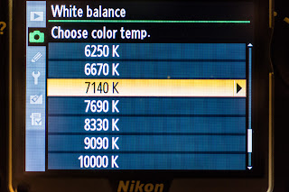
This time I changed the white balance to a custom color temperature of 7140K and then used the fine-tune grid option to introduce more Amber and Magenta. Those settings are A6 and M6. In ACR this image shows as 7450K and +78 Magenta.

The Amber and Blue axis of the fine-tune grid in my Nikon D700 doesn't apply another type of filter. It simply shifts the actual color temperature up or down. This is evident because the custom white balance in the camera was set to 7140K, A6, M6. Fine-tuning the white balance for Amber 6 and Magenta 6 now indicates a color temperature of 9090K. However, in ACR the corrected color temperature is 7450K and +78 Magenta.


What words would you use now to describe the colors and tones in this image?
Dreamy? Vibrant? Unworldly? Exciting? Purply?


This new image is much closer to what I was feeling when I was taking the image and what I wanted to convey. By deliberately introducing a color cast by fine-tuning the white balance in the camera, I am able to change the feeling of the image and more closely deliver what I wanted in the image.

Below is the final image after post-processing. Just a subtle shift in color temperature again and this time to enhance the blues and purples more. In ACR the color temperature is 6200K and +80 Magenta. The shift to a cooler temperature is what is responsible for bringing out the blues and purples more.


Now the one question you may be asking right now that I don't have an exact answer for is, how do I know what color temperature I should use?

You have to experiment. You have to try both when you are taking the photo and then when you are post-processing the photo to see the endless possibilities that are out there. Through trial and error and experimentation are how I usually arrive at a particular setting. Who knows, maybe sometimes when you are in the field taking photographs you later find something more pleasing in post-processing that differs from what you originally envisioned and captured. With the freedom of shooting RAW and software such as Adobe Camera Raw, you are not ever limited or penalized by choices you made when you took the photograph.

There is of course one rule of thumb, so-to-speak, that I can offer that you can use to help with your decision making. Lower temperatures are considered cooler and thus will often yield images with a blue-ish cast. Higher temperatures are considered warmer and will yield images with a golden or yellowish cast. Where things get interesting is when you fine-tune the white balance and you apply a green or magenta cast.

I often apply more magenta when I experiment with white balance. It does a great job of enhancing both red and pink tones and purple tones, depending on what the color temperature is. With cooler temperatures (e.g. 4500K) and a magenta cast, you'll often see deep purple tones. With warmer temperatures (e.g. 6500K) and a magenta cast, you'll often see pinkish tones. I don't often use the green filter in situations such as the one depicted here. However, I can definitely see a benefit with scenes deep within a forest or canopy of lush greens where using the green filter could work.

Results will greatly vary depending on your subject and the lighting of course. These techniques probably won't translate well to portraiture work! Here are a couple of more examples.


These three images were taken a little while after sunrise with some beautiful alto-cumulus clouds in the sky creating a sort of sun pillar effect.

The first image on the left demonstrates what Auto White Balance looks like. ACR reports this as 4000K. Here you can say everything is very blue and cool. The colors in the sky and the clouds were much more brilliant to my eye than this. Its fair to say that this isn't an accurate representation of how that morning looked and felt.

The second image demonstrates a Daylight White Balance setting. ACR reports this as 5500K and +10 Magenta. While there is a bit more color than the first image, it still lacked the punch and vibrancy that I actually saw and felt that morning. Getting there, but not quite all the way there.

The third and final image in this example is the custom White Balance setting I used to take the photograph. This was 5000K, A6, M6 and ACR reports this as 5850K and +76 Magenta. Here now we can see the colors go wild and really draw you into how magnificent that morning really was. Alto-cumulus clouds are some of the finest clouds to lay eyes on and when you couple that with a rising or setting sun, get ready for a wild ride with mother nature nearing her best! Since the colors were so vivid already, I didn't have to raise the color temperature beyond 5000K to really get the pinks and the purples to come alive when applying the Magenta filter.


These two images were taken in the twilight before sunrise. There was a good bit of low clouds on the horizon where the sun would rise and this helped block some of the early light and it seemed to extend twilight just a little bit longer for me.

The first image of two was taken at Daylight White Balance. ACR reports this as 5000K and -6 Magenta (or +6 Green). To me, this again was not an accurate representation of what I was seeing. Deep twilight is very cool and blue and the colors here make me think more of a sea foam green.

The second image is what I took with a custom White Balance. ACR reports this as 4150K and +33 Magenta. By lowering the color temperature and adding a magenta filter I was able to extract a much cooler and softer glow from the scene than previously. Here we see deeper blues and purples with a lower color temperature and some magenta added.

In conclusion...


Don't be afraid and experiment with custom white balance settings both when you are taking photos and afterwards during post-procesing. Don't be afraid to push the limits sometimes and try extreme color temperatures such as 2500K or 10000K or really push the sliders with magenta and green. There are tons of creative possibilities waiting out there and it never hurts to experiment. So give it a try and have fun with it next time you are out capturing the landscapes!


Tuesday, February 7, 2012

Recovery?

I want to talk about something I've learned recently and that's about the blinkeys, blown highlights or clipping, and the magical Recovery slider in Adobe Camera Raw (ACR). You know, the blinkeys. Those insipid pixels that blink on the back of your camera when you review an image and the camera wants to let you know that you've gone too far and clipping is occurring.

Up until now, I've thought of the blinkeys and blown highlights or clipping as being truly evil and something to avoid at all possible cost because its lost data. 255, 255, 255, pure white, no detail. Something your printer won't even print out because there's no white ink!

In order to combat this we are armed with the Recovery slider in ACR. With one quick movement to the right we can eliminate said blinkeys and blast those blown highlights back into the realm of subtle detail! But alas, sometimes the Recovery slider falsely leads us astray and alters our images with a flattened dynamic range and bleeds any pop from them. What's left is a distant memory of the zeal your original image contained.

All is not lost. I've come to realize that not all blinkeys and blown highlights are created equal. Some are not as evil as other would lead you to believe. Sometimes you don't need to touch that Recovery slider at all!

Above is an image where highlight clipping is obviously occurring. Thanks to ACR we can clearly see that and said areas are highlighted in a fantastic and not so subtle red. Usually I would be tempted to slide the Recovery slider to the right until I've eliminated all clipping. In many cases, you'll end up with an image now with a flattened dynamic range and a lot less pop in the highlights and bright areas of the image. Since there's a lot of sky in this photograph, using lots of Recovery has an adverse affect on the image. You can compromise some, leave some clipping but recover some of the blown out areas.

So what's going on here?


I started thinking about what these clipped highlights actually are and what effect do they have on my final product and image. I typically share my images on the Internet like many do and then I print the images that I like best.

So, for sharing on the Internet, do the clipped highlights really matter? I don't think they do.

What about printing? Hmm, well, yea, I think they do matter.

Why? Well first off like I said before, there's no white ink, and second, my printer has a limited color gamut so it's best to try to process my images so they match my printer's color gamut as much as possible so screen and print match as closely as possible.

With this new thinking, clipping matters to me when I'm printing. And what my printer can print is what I should really be concerned with. That lead me to my next question and discovery...

What colors are actually present in these clipped regions?


Lucky for us ACR has the Color Sampler Tool (S). Select this tool and then select a point in your image and ACR will tell you what color is there. So I did that and selected nine different points in the clipped regions.

Those nine different points revealed some very interesting information from them.

It would appear that many of these clipped regions are not actually pure white which I thought was the case. It appears that only some of the RGB values are 255. True, there were some that were pure white, 255, 255, 255. But others were really really light shades of pink and magenta.


So I know my printer can't print out pure white but maybe it can print out really really light shades of pink and magenta. To test that theory out I let go of all desire to slide Recovery to the right and just clicked Open Image with reckless abandon! Well, maybe I'm exaggerating just a bit.

In Photoshop, I turned on Proof Colors and loaded up a profile I would typically use to print out an image like this. I also turned on the Gamut Warning. The result on my screen was what you see below...

That's not so bad, right?


Seems like my printer can't handle a few regions of really really bright magenta and pink. The gray areas are where my printer doesn't have a color to match the color in those areas. Seems like my printer does a pretty good job of rendering the colors that ACR and the blinkeys normally would lead me to believe were evil!

In fact, if you overlay the ACR image and the soft-proofed Photoshop version, you can see how well the colors would hold up in a printed image.

The darkened red areas are the intersection of the areas that are out of gamut for my printer and what ACR says has highlight clipping. There are even regions where there are out of gamut colors but ACR didn't claim any highlight clipping there.

Now I have a lot of confidence in my printer and its ability to print this image and match colors so well that perhaps the subtle tone and color differences in these out of gamut areas won't even be noticeable in a print. I could find out by printing and reviewing. That sounds like a good test. I could also play the compromise game and go back to ACR and move the Recovery slider and then later play with Hue, Saturation, and Vibrance and use brushes or masks of some sort to try and bring these out of gamut colors back in gamut.

Sounds like a lot of work. Why not just print a test image and see what we see? Maybe things aren't as bad and as evil as we have been lead to believe. Perhaps the print will look great regardless of what all this technology says should not! Perhaps using our eyes and a little bit of faith is all we need instead of examining each and every pixel in our images and being fooled by all the alarms and warnings. Beauty is in the eye of the beholder, isn't it?

So, know what is in your image as far as colors. Know your final product and goal. Know what your printer can handle. Print out a test print. Make adjustments as needed and iterate. Don't just blindly move sliders and alter colors simply because the computer told you there may be a problem. In the end, you'll end up with fewer if any compromises and much better images.


Wednesday, January 11, 2012

SMDV RFN-4s Wireless Shutter Release for Nikon

The SMDV RFN-4s Wireless Shutter Release for Nikon that I ordered just arrived in the mail today. I've been using the Nikon MC-30 wired shutter release on my D700 until now. The MC-30 does the job but having the remote attached to my camera makes it cumbersome to take out and put back into my bag. I primarily store my camera gear in a Kata Bug-255UL backpack. Space is tight with all my gear so it was a real pain to keep the remote cable attached. I couldn't essentially so having to attach and detach all the time got to be a real drag especially when I knew there had to be a wireless solution out there that would be compact and perform well.


Well my prayers were answered and I stumbled upon the SMDV wireless shutter release on Amazon and decided to give it a try!


The RFN-4s is made by SMDV. A company that I've never heard of but they are a South Korean company so anything made by my peeps has to be good, right? :)


The unit comes in an attract case, worthy to be put on display on the shelves and glass display cases of any good camera store. What you get is one transmitter, one receiver, a small carrying case, a small wrist-like strap for the transmitter, a battery for the transmitter, and of course, instructions. The transmitter is small and fits in your hand easily and resembles a small clicker for presentations. The receiver has a small antenna and overall looks like a miniature walkie-talkie. The transmitter takes a single AAA battery that is included. The receiver is powered by the camera.


I read through the instructions quickly and setting the unit up was simply only a matter of installing the battery in the transmitter, attaching the receiver to the camera, and voilĂ , take a picture! The receiver screws into the front remote port of my D700 just like the MC-30 remote did. It fit in very securely, no problems with the threads. The little red LED on the receiver began blinking immediately, letting me know that its powered up. Per the instructions, it will auto-power off after 2 hours of inactivity. You can always just turn it off manually by depressing the button on the front of the transmitter for 1 second.


The transmitter operates over the standard WiFi/microwave oven/cordless telephone frequency range of 2.4Ghz. Because of this, it has 16 different selectable channels you can set the transmitter and receiver to in case you get interference from other devices that prevent the unit from working properly. The unit came already set to channel 16 and I left it at that.


From the photos below, you can see the transmitter attached to my camera and its fairly unobtrusive and perhaps even makes the D700 a fair bit more "professional" looking (LOL). 


The unit worked right out of the box without a hitch. Depressing the remote button half-way is just like your shutter release button on the camera. It will auto-focus and meter for you. The front of the receiver actually has another LED that lights up to let you know it is auto-focusing. Next, you just press the release button on the transmitter and your camera instantly takes a photo. A third LED on the receiver lets you know when the shutter is released.


If you put your camera in BULB mode, the transmitter will work as well. In this mode, just depress the remote button until a blue LED on the transmitter lights up. This means the shutter is now open. Press the remote button again and the shutter will close. You don't have to hold the remote button down to keep the shutter open. Nice little function if you ask me.


SMDV claims the transmitter will work up to 100m. That's as long as a football field to us Americans. That's pretty far. I wasn't about to test the ultimate limits of the transmitter myself but I figure I see how it does indoors in my house. Well I can tell you that from 3 floors away, the camera on the 3rd floor, me on the ground floor, the transmitter triggered the shutter flawlessly. Wow, that's more range than I'll ever need. 


So far this little unit is racking up a lot of positive points for me. Its well designed. Compact. Unobtrusive. And works. What's the last thing? It fits in my backpack without having to remove it!


Next test is the long-term test out in the field. I'll carry a spare battery and my old MC-30 as backup just in case. I'll report back after some time of using this to let you know the final verdict but so far this little guy gets 5 stars from me.


You can pick on up on Amazon. They make these for both Canon and Nikon. Just check the compatibility list before you purchase one to make sure it works with your camera. the RFN-4s is said to work with the Nikon D700, D300, D300s, D200, D100 (Battery Grip Required), D3, D3S, D3X, D2, D2Xs, D2X, D2H, D1H, and D1.


Wednesday, November 23, 2011

Windows Phone 7 app - Shuttermate

I've written my first published Windows Phone 7 app and its called Shuttermate.

I consider it a tool for landscape photographers. It contains a few different simple tools to help you with calculating exposure times or selecting the best filter to use. I do assume two things with this app. One, you use Aperture priority mode with your camera. Two, your camera is a Nikon DSLR. Now your camera doesn't strictly have to be a Nikon DSLR but some of the values you pick from in the tools may not apply to you or maybe your camera has more. I shoot with a Nikon D700 so I targeted everything for that camera.


nd filter

If you want to shoot at a target exposure say because you want to take a photograph of a waterfall and would like the water to be silky smooth with a 2.5 second exposure, you would use the 'nd filter' tool. Just put in your current exposure settings and your target exposure setting of 2.5 seconds and the app will tell you what ND filter density to use.


dynamic range

Taking a photograph that includes both a bright sky and a shadowy and darker foreground? The "dynamic range" tool will tell you the difference in stops between two exposure settings. Just put in your exposure setting for the sky and then another for the foreground and the app will tell you the dynamic range between the two. This may help you select the best ND graduated filter to use perhaps.


big stopper

Do you use a Lee Big Stopper or some other  10-stop ND filter? Use the 'big stopper' tool and put in your initial exposure before you use the filter and the app will tell you what your new exposure time will need to be when you use the filter.


long exposure

The last tool is one that helps you determine the correct long exposure time if you use the ISO bumping trick as I call it. I learned this trick from a one Bruce Percy while on a workshop with him. If you like to take photographs in low light like I do, say 30 minutes before sunrise or after sunset, most likely your camera won't meter properly and will stop at 30 seconds. At 30 seconds you will probably be underexposed. That's ok, just increase your ISO until the camera meters properly and tells you the scene is properly exposed. Now on my camera, the usable ISO ranges from 200 to 6400, that's 5-stops of dynamic range. If its too dark out, 5-stops may not be enough. Maybe time to break out the flashlights or call it a day? Anyhow, just enter in the initial ISO you started with and then the adjusted ISO and the app will tell you how long of an exposure you will need to take when using the initial ISO. Now on my D700, the display for the metering will also tell me if i'm -3EV or +3EV from a proper exposure. If you've hit the limit for your ISO and are still underexposed but maybe only by -3EV at the most, you can enter this value into the app and it will take it into consideration when telling you the proper exposure time.


That last tool does take a bit of explaining and its only useful in special circumstances. That's why its at the end of the list of tools. I don't use it very often but in the past when I needed this, I would have to perform some mental mathematical gymnastics to figure out my exposure time while the light was changing before my eyes! Working with fractional shutter speeds and exposure times is not exactly "easy" math if you ask me. So this is why I wrote this little app. No more mathematical mental gymnastics while out in the field. Now I can just concentrate on taking photographs and being creative and perhaps let that other half of my brain take a break.

Tuesday, August 30, 2011

JPEG Quality in Photoshop

Regarding the information posted in this article from petapixel.com I decided to do a quick comparison to see if there is some truth to the statements mentioned in there.


I wanted to see what the perceived quality and file size is among various JPEG quality levels when exporting images from Photoshop CS5. I know the article states that sometimes quality is affected opposite from what you might expect but I figured that it was worth a shot. There are no absolutes with many things in life and this shouldn't be any exception.


I took two basic photos. I'm using a Nikon D700, 50mm f/1.8 AI-s lens, and SB-600 flash mounted on camera in TTL. The photos were taken indoors at f/5.6 and 1/60th. The RAW came in at 2832x4256 and 15.04MB. I didn't perform any post-processing and right from Bridge I simply exported 5 JPEGs at quality levels 6, 7, 8, 10, and 12.


Here is a screenshot for Levels 6-8 with one area of detail zoomed in at 200%:


Under close inspection from my end I can actually say that the artifacts that you normally see with JPEG compression is noticeably more going from Level 6 to Level 7 and notice that the file size is nearly the same. The difference is very slight but if you look hard enough (too hard really) you can find them. Level 8 is noticeably larger, as expected, and the amount of artifacts is less.


Here's a screenshot for Levels 10 and 12 with the area of detail zoomed in at 200% again:


Artifacts? There are a few in Level 10 and I would say they are less than the previous batch. What about Level 12? I can actually see a few less again. File size? more than doubled between 10 and 12. As you can see, we are getting quite large as well.


So, what's the quick verdict on this? There seems to be some truth to the statement that when you go from Level 6 to Level 7 you may lose some quality while the file size stays about the same. So Level 6 may be the better alternative to Level 7. However if you are counting pixels perhaps bumping to Level 8 will ease you, that is unless you are trying to stay within a specific threshold for file sizes (please be conscience of mobile users!)


As far as the statements about Levels 11 and 12 being "experimental" and not really adding to overall quality. Well I can't say there is obvious evidence of this because I did notice fewer artifacts when using Level 12 vs. Level 10. The file size did more than double.


Now I know this was not very scientific and there are many types of images and variables that should come into play regarding this, however, doing a thorough scientific evaluation wasn't the point of this little experiment. All I wanted to do is find out if these statements were completely bogus or if they actually had some truth to them. A good place to start with some further research is with the Adobe Photoshop development team. They can answer the differences in the algorithms being used among all the various levels...

Friday, August 5, 2011

Stitching

Two frames, stitched vertically
I've begun experimenting with stitching. That is, taking one xor more photographs (yes, xor, not or. one or the other but not both :) and stitching them together to obtain either a larger field of view and larger image. I like stitching photos because it gives a squarish crop, rather than the standard 3:2 for most cameras today. 3:2 works for many compositions but there are other times that I do prefer something closer to 1:1. I also like stitching because the end result is an image that is far larger and contains far more pixels than my camera can capture alone. This is what I want when I want to print large images and retain as much detail as possible. I'm not interested in switching to medium format film to obtain this same aspect ratio. I like working with digital and all that it provides. I'm also not prepared to dump the cost of a new luxury car entirely on a digital medium format camera as well. There are other options though...


One option is to clunk down about $2000 USD for a Nikon 24mm PC-E lens and use the shift functionality to create multiple images that may be easily stitched. Here you can shift up/down or right/left with the camera in either landscape or portrait orientation to satisfy the need for just about any composition. The other option to consider is a rail or pano(ramic) setup to allow me to create multiple images that may be stitched. This is the less expensive option and I can use it with any lens that I have. I decided to try a simple sliding rail setup and purchased the Really Right Stuff 192-PPP (Precision Plus Package). I didn't get a full panoramic setup for multi-axis rotation of the camera and lens because I didn't really want the added complication (and cost) and I could forgo some of that capability for now. I can always add more hardware later.


Stitching is now very easy when using the PS CS5 Photomerge feature. Results are had in just a few clicks and images are seamlessly blended and distortion free. There's not much to worry about when your images do not suffer from any perspective or distortion problems from the beginning. In particular, you have to avoid parallax distortion or errors between you images. To do this you have to rotate your camera and lens around then entrance pupil or no-parallax point. This is essentially what panoramic setups like the 192-PPP allow you to do.


Not all compositions and images will suffer from this optical phenomenon enough to prevent stitching. Much depends on the subject as well as the the perspective from where the image was taken from frame to frame. In fact, I was successful in stitching together several new images recently without the aid of the 192-PPP. The image to the right is composed of three individual images stitched together. The combination of using a long lens (400mm) and using subjects that were some distance away reduced the amount of vertical movement I made to compose each frame. This reduced the amount of distortion from frame to frame even though I was not rotating or moving the camera and lens around the no-parallax point. I have to owe all of the credit to the awesome power of the Photomerge tool though.


In the end, you'll most likely have to contend with these distortions in your some of your compositions and there is no substitute for knowing how and having the correct tools to do so. You can't always rely on the Photomerge tool to bail you out.


I placed my camera and a 25mm lens with the 192-PPP all on the tripod and then setup a scene to determine the no-parallax point for this lens. I've read that people like to call this the nodal point but from what I understand, this term is technically incorrect for what we are trying to accomplish here. I'll just stick with no-parallax and move on. The scene I setup was just a simple lineup of a near and a far object. Through trial and error I determined the approximate no-parallax point for this lens.


There are a couple of pointers or tips that I found which may be very helpful:

  1. Make sure the camera is level
  2. When rotating the camera to the left or the right, if the far object moves in the same direction in relation to the near object, then you are too far forward, move back
  3. When rotating the camera to the left or the right, if the far object moves in the opposite direction in relation to the near object, then you are too far back, move forward

I then proceeded to go through all of my lenses and do the same. With prime lenses, you just have to do it once. With zoom lenses, you have to do it for each focal length you believe you will use. For example, with my 80-200mm, I determined the no-parallax point for the 80, 105, 135, and 200mm focal lengths. Once that was completed I simply printed these out and made a handy little cheat sheet that I carry with me in my bag that I can refer to each time I need to know the no-parallax point for one of my lenses. Now I can make easily stitch-able images using the no-parallax point without having to calibrate it each time.